Assignment Description:
Part I: Finding Examples
Find one piece of effective communication design and one piece of ineffective communication design, and add each example to the class Google slide deckLinks to an external site.. For the next class, come prepared to give a short two or three-minute presentation to the class introducing yourself and explaining why you find your examples to be effective and ineffective. Please do not limit your examples to traditional print media (posters, books, magazines).
Communication Design also exists in signage, packaging, merchandising, consumer products, the web, and more. Look at real-world examples in context. (Don’t Google good or bad design...) For instance, if you use a banking website that you think has a great interface or visualization, take a screenshot. If you see a horribly designed flyer, you can bring it to class (but also take a photo). If you see something out in the world, take a picture. However, refrain from searching for images of posters, billboards, or gadgets online. It will help to experience the design in the setting intended and at the scale it is designed for to understand the communication value.
Part II: Medium Post
In addition, post your examples to Medium. Write a paragraph for each example explaining why it is effective or ineffective. Be sure to label each paragraph so that we can tell which is effective and which is ineffective and include images of your examples (citing the source of the images).
Questions to keep in mind:
What is it? What’s the context? Who is it intended for? Where is it situated?
What’s the goal of the design? Is the goal achieved with the design? Why or why not?
What message is it communicating? How is it doing this via the use of type? Color? Image? Layout?
Do these elements work together or against each other?
Effective Design Example:
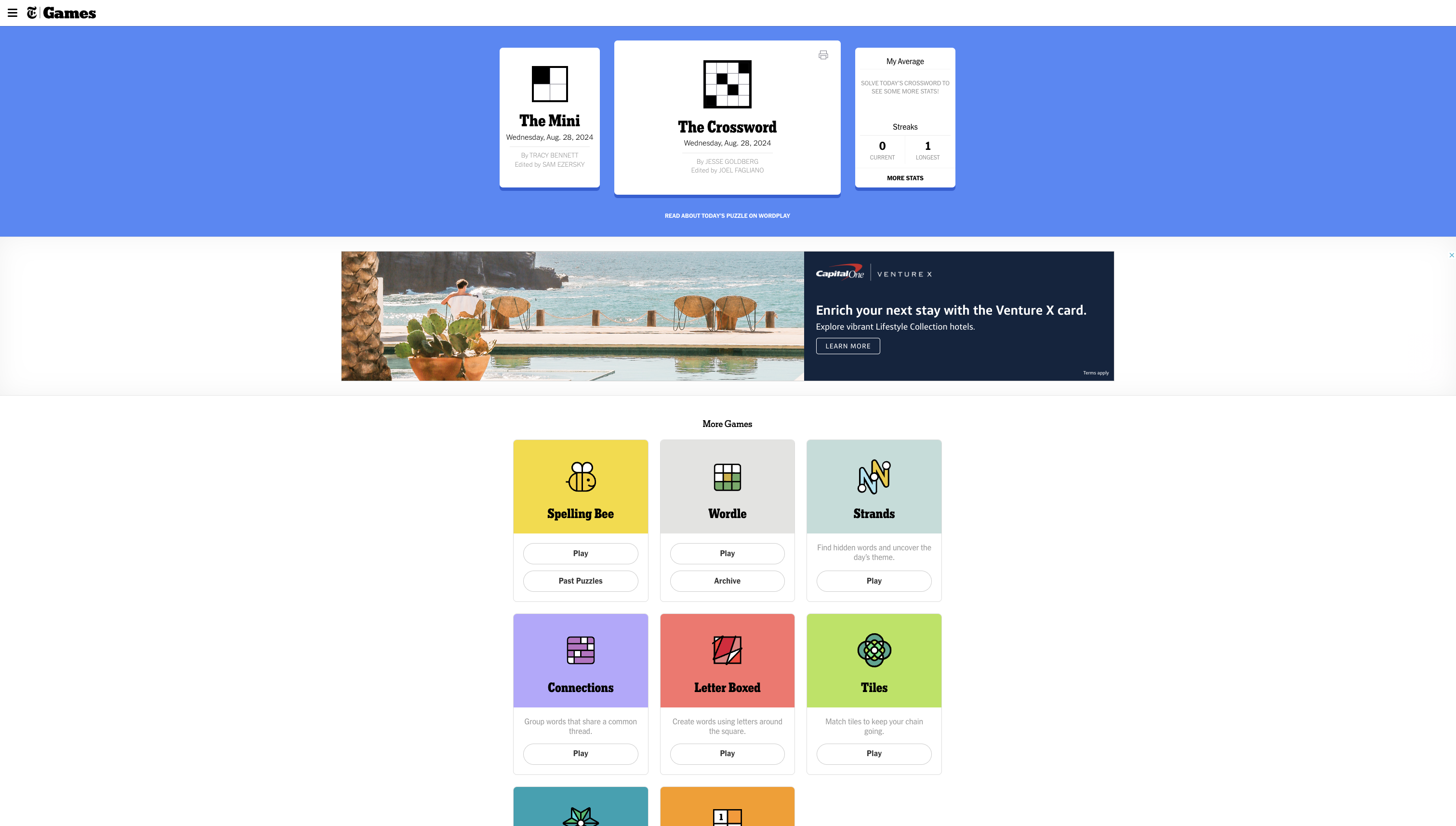
This New York Times games homepage is an example of an effective design. The most popular games are displayed at the top, and the solid color background for the hero section clearly conveys hierarchy. There are also statistics about the user easily accessible. The remaining games are displayed clearly and concisely, with bright colors and bold text to make identification easy for both new and experienced users.
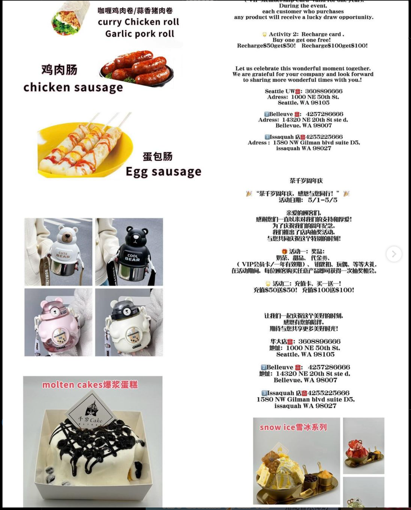
Ineffective Design Example:
This is a promotional flyer posted on instagram for a boba and dessert cafe I worked at a while ago. The overall formatting is cluttered and messy, and the text is also vague.
First, the formatting. The information and the photos do not complement each other. While the text talks about a sweepstakes and gift cards, the images show products that are offered at the store. The spacing between the text and images also detract from the viewing experience. the spacings are inconsistent, which are bothersome. The text padding is minimized in order to fit more of it, but results in a difficult viewing experience. The text is also cut off on both ends.
The content of the text is also poorly designed, although it may be the result of translation technologies. The text is vague, and does not clearly describe the promotion. For example, the first paragraph mentions a "lucky draw", but does not explain what the prize is. The second paragraph describes a promotion regarding gift cards, but calling it a "recharge card" makes it difficult to understand.