For this project, I chose to work with the Pittsburgh International Jazz Festival. Before beginning to work on sketches for the poster, I did some preliminary research on the festival and the organizations that help run it.
First, I referenced the sheet that was passed out in class. Here, I got an overview of what the festival was going to look like.
Next, I consulted the website for the festival, pittsburghjazzfest.org. Here, I got a better idea of the details of the event, including the scale and scope of the event. I also got a sense of who the audience of the flyer might be. I also took note of the color scheme of the website, which I will consider implementing in my flyer.
After exhausting all the tabs of the festival website, I moved on to the August Wilson African American Cultural Center, which is the organization that hosts the festival. There, I got a sense of their mission, which gives me more information into what is important to them, and what I might want to emphasize in my flyer.
Here is a text file of the notes I took from each source:
notes
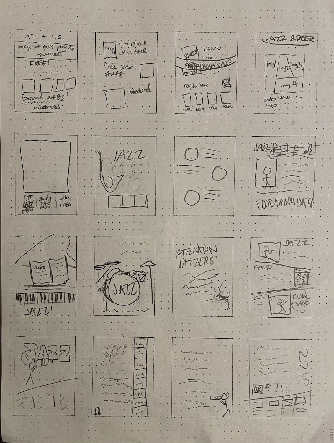
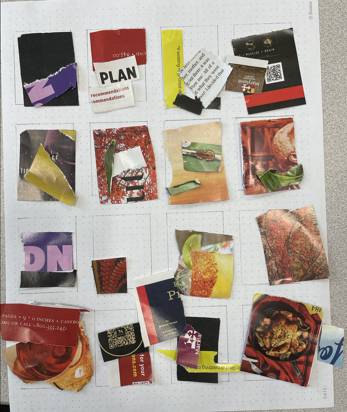
After exploring these websites, I got a sense that I wanted to include images of the jazz musicians in my flyer. I then created my thumbnails based on this assumption, with most of my designs allowing room for images. Below is a photo of my thumbnails:
Exercise 2: Grid Analysis
For this exercise, we were given two posters of different sizes to analyze the grid layouts of. Through this exercise, I got to see the variability between different grid layouts, and how even the same grid can produce vastly different designs. I learned how to use grids and negative space to cleanly display information.
When working on my own poster, I will keep in mind these design techniques, and choose my grid layout based on the grouping of information, so that the information can be conveyed clearly.
Exercise 3: Working with a Grid / Composition
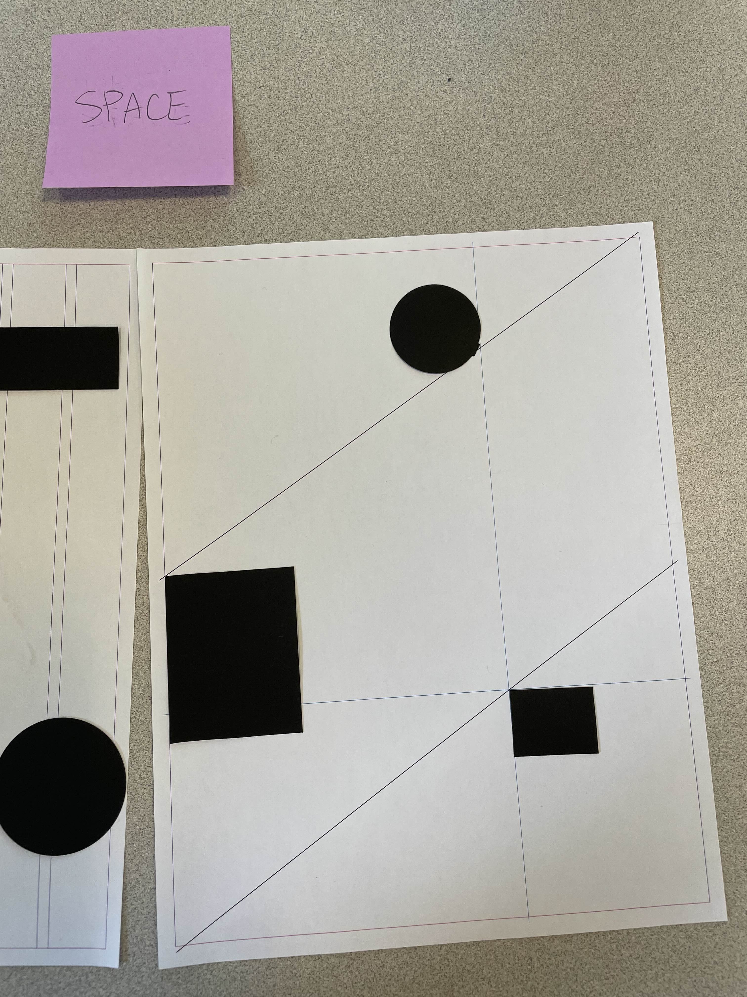
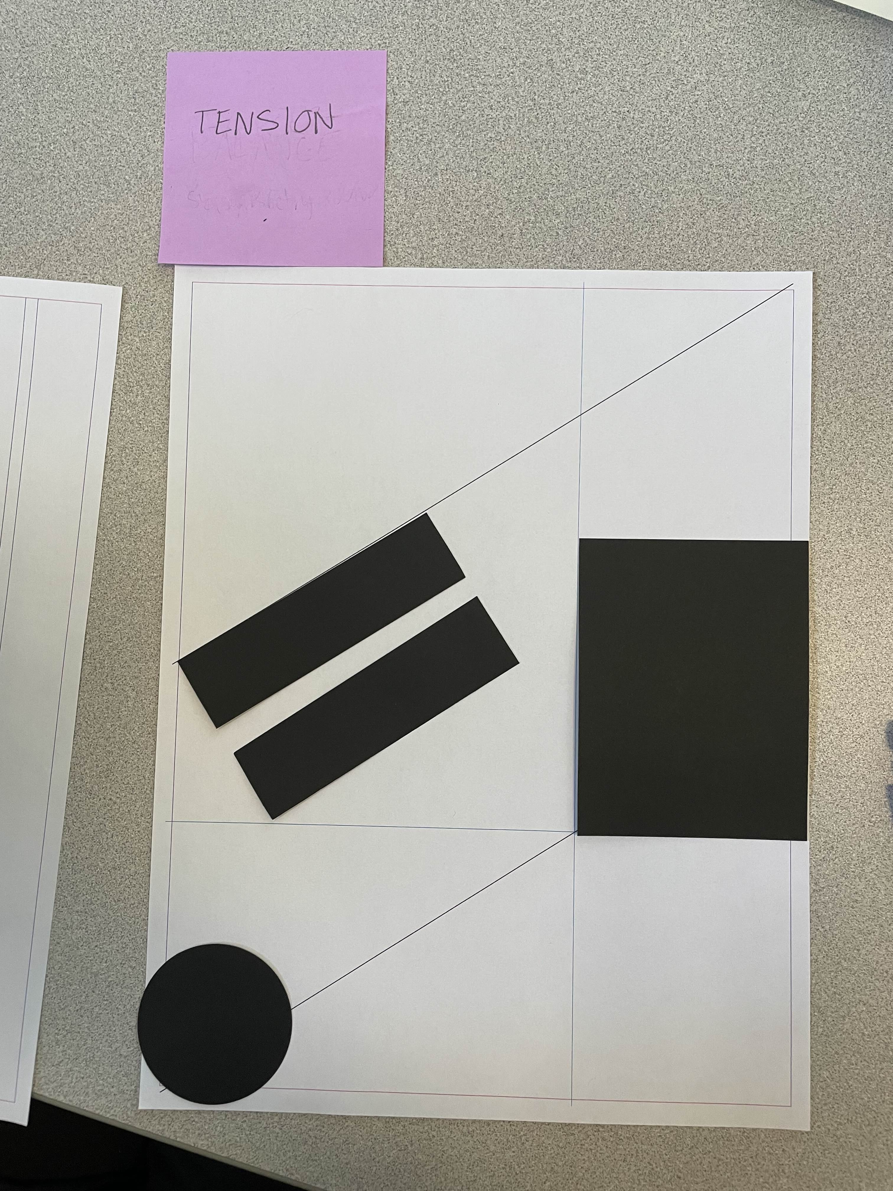
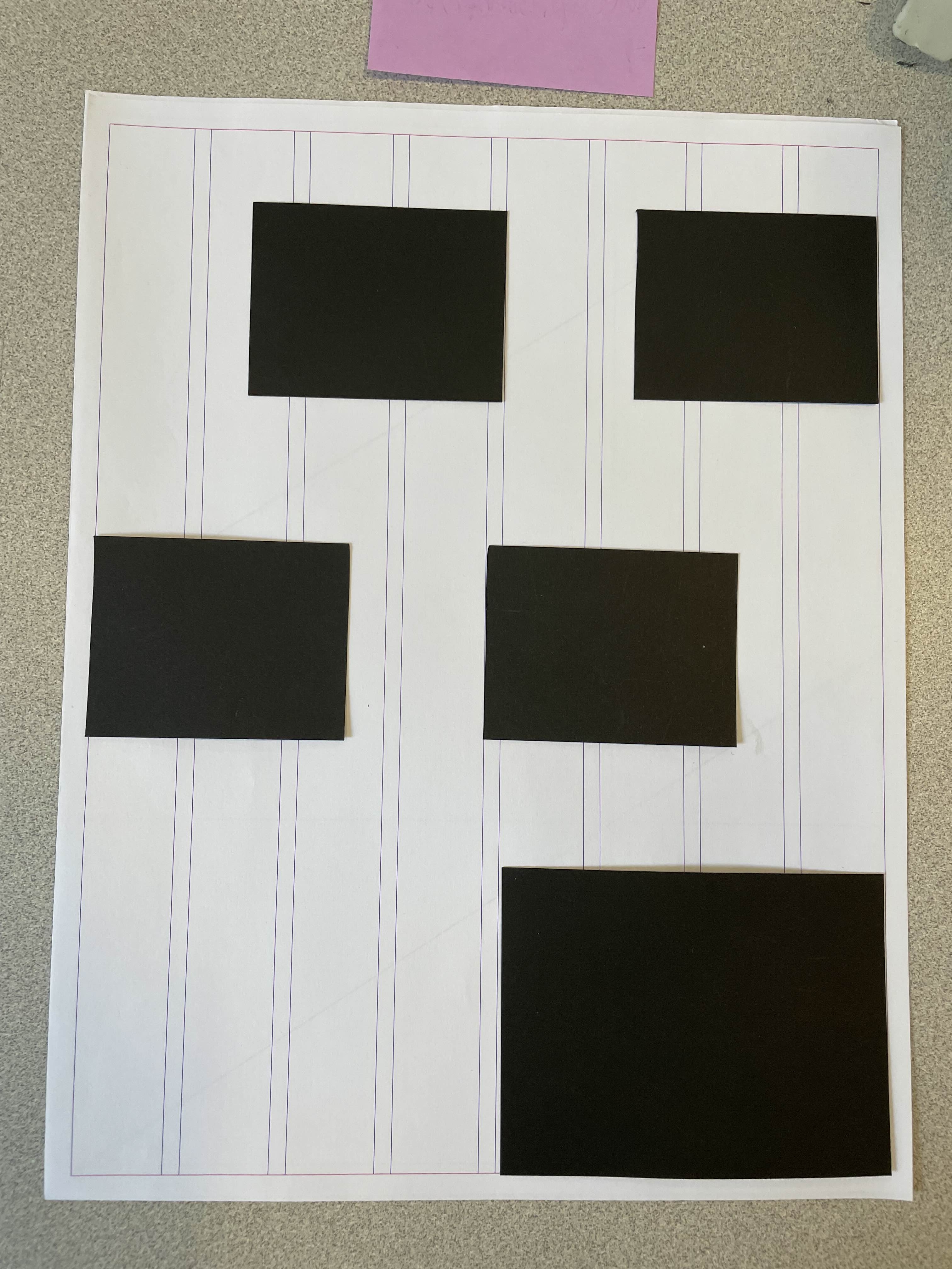
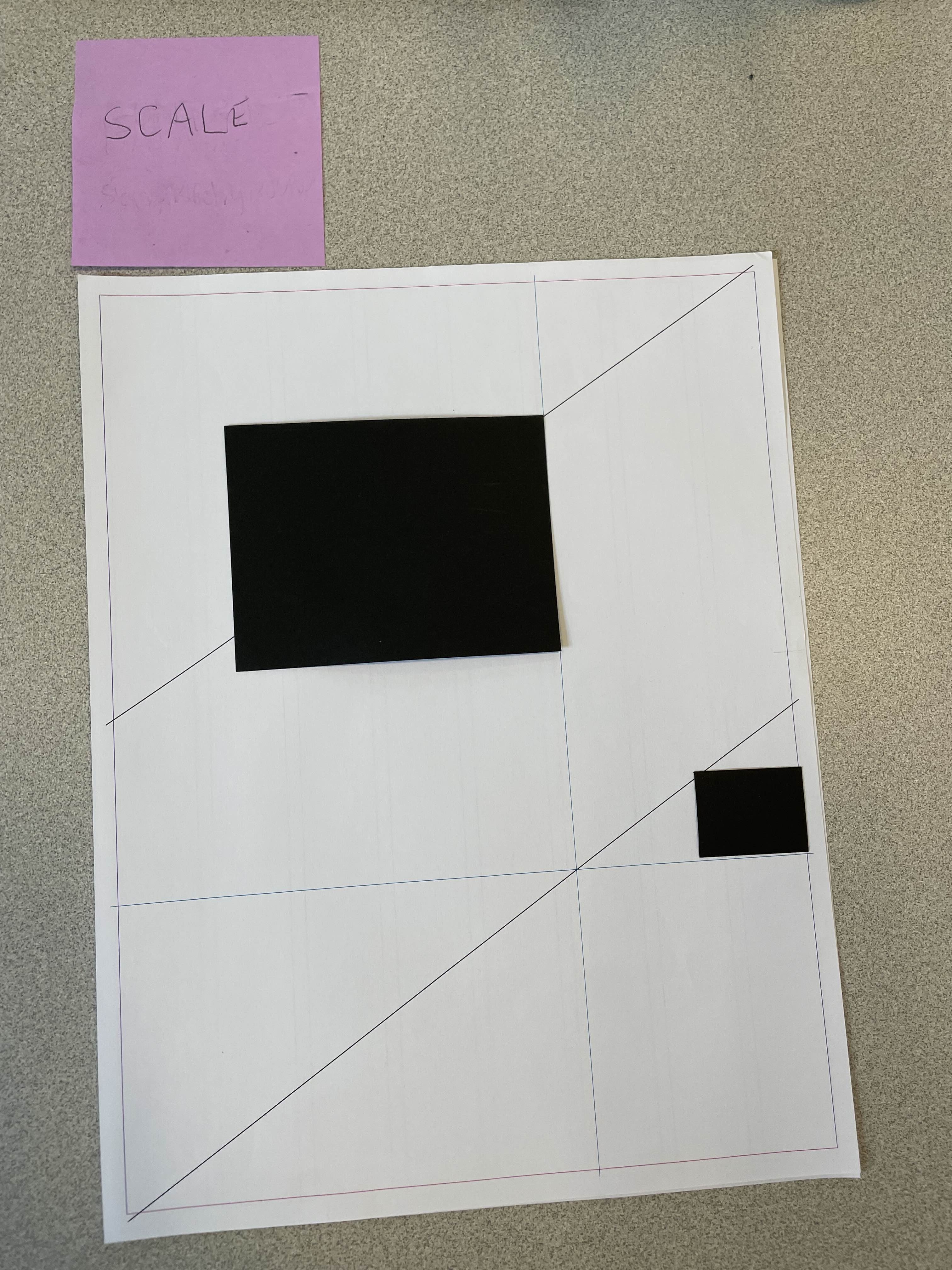
For this exercise, we were given letter paper with different grids on them, and shape cutouts to place against the grid to demonstrate different design principles with. While making these designs, we kept in mind the information we intended to display on our poster, which we would use as a guide to our groupings. Below are a few of the designs that I liked or that I thought would work well for my flyer:
This design was for the concept of space. We were challenged to use the whitespace, instead of the elements, to communicate a message. Throughout this activity, I realized that I enjoy the designs with a lot of space, because the pieces look intentionally placed and uncrowded.
This design was for the concept of tension, but it also shows movement with the slanted sections. Because there is a lot of movement in jazz, I thought it would be good to incorporate this movement in the flyer as well.
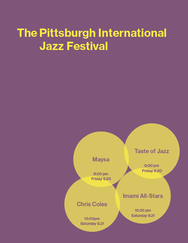
This design was to illustrate the concept of unity. It features the same shape repeated in uniform positions. Because it is uniform, it does not look too cluttered, even though there are quite a few sections. This design would work well for my flyer, because there is a lot of different information that need to be displayed, and the abundance of sections make this easy.
The concept being illustrated here is scale. There is one large shape, and one small shape of a drastically different size. This design uses whitespace and scale to emphasize the larger and more centered section. I can use this to clearly display primary and secondary information in my flyer.
Exercise 4: Hierarchy / Alignment & Proximity
For this assignment, we were given the task of making posters with one style, size, and weight of text. Overall, this exercise was difficult, because there was limited text to work with, and nothing except for one style and one size and one weight of text to fill the entire page. Through this exercise, I got comfortable with whitespace and experimented in ways to group information to convey it clearly. Below are a few of my designs:
This is the rendering of one of my unity and repitition designs from the previous exercise. I centered the information about the festival to convey its heirarchy.
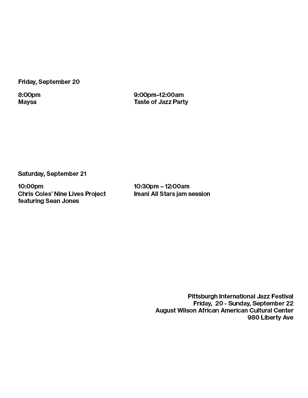
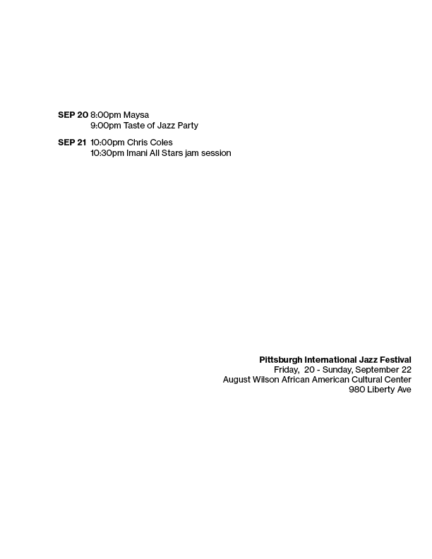
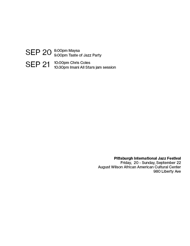
This design is for repitition. I put information about the events in boxes based on what kind of event they were and what day they were on. This repetition does not seem very effective, however, because there are different types of information in each box.
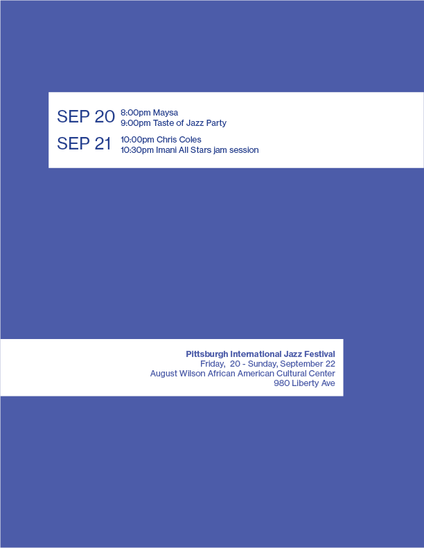
For this design, I tried to group the information into their days, and then into each separate events. This was difficult because the amount of text each event was varied greatly. The groups turned out somewhat clear, but the design is clunky. I enjoy the spacing of aligning details and information to one side of the page, and the title of the festival or the organization on the other.
Exercise 5: Hierarchy / Contrast & Scale
For this assignment, we were able to branch out into different weights and sizes of text. We used this, along with whitespace and positioning, to convey heirarchy. Below are a few of my designs:
For this design, I used different font weights. I made the title of the festival, along with the dates, bold. I like how this hierarchy is subtly, yet clearly displayed, and it keeps the whitespace that makes the design look elegant.
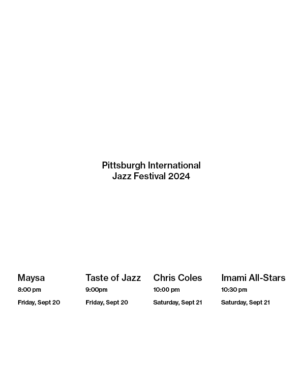
For this design, I used two different text sizes to convey hierarchy. I also used whitespace to emphasize the title. The larger font for each of the events seemed a bit too much for me, and the spacing was a bit difficult to do because each event had different amounts of text. It was difficult to decide between spacing them evenly in relation to each other, or spacing them evenly along the page.
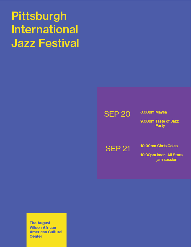
This poster is one of the posters that incorporated both different sizes and different weights. For most of these posters, I used larger font for the title, and heavier weights as group headings. For this design, however, I experimented with keeping the title as a smaller font, and using the larger fonts to group my information. Overall, it seems to be pretty effective, as the date being larger means it is aligned with all of the events of the day. It does take some of the emphasis away from the title. This does bring into question if the title of the festival is the most important, seeing as it can be somewhat inferred from the events it offers.
Exercise 6: Hierarchy / Color
In this assignment, we explored color theory and how it is used to create hierarchy.
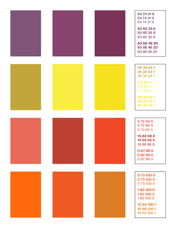
First, we worked on paper, finding colors and color combinations that we thought would be effective in magazine clippings. Below is an image of my work. In the top half, the colors are somewhat oriented in ways that seemed effective. The bottom half is just a jumble of colors that seemed to work together.
Next, I took these colors and recreated them to the best of my ability in inDesign. I made different versions of each color to see which ones turn out well on paper. After creating palettes for my background colors, I made palettes for their complementary colors. I then put them together to see which colors went well together. I printed these out to see how they would turn out on print, which is different from what I see on screen.
after printing out these colors, I chose some that I thought would have good contrast and represent jazz the most, and tried implementing them into my designs.
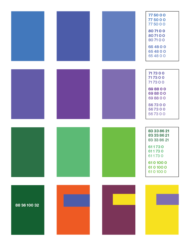
These three designs were made with one color in addition to black and white. In the first one, I used color only on the title to put emphasis on it. In the second, I used blue as the background, and put information in white boxes. When this was printed, however, some classmates saw the blue as the foreground, and the white as the background, which drew their attention away from the important information.
These posters were made with two and three colors, respectively. For my next round, I wish to add more movement to better represent jazz, by using less squares and more organic shapes, both in the text and in the colors.
Final Iterations
After working on adding color, we went through one more iteration, which we got feedback on to implement in our final design.
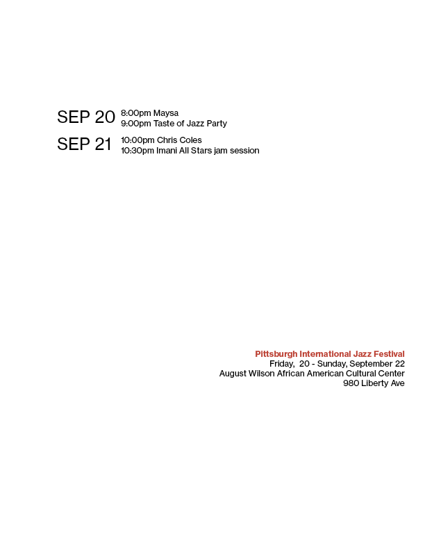
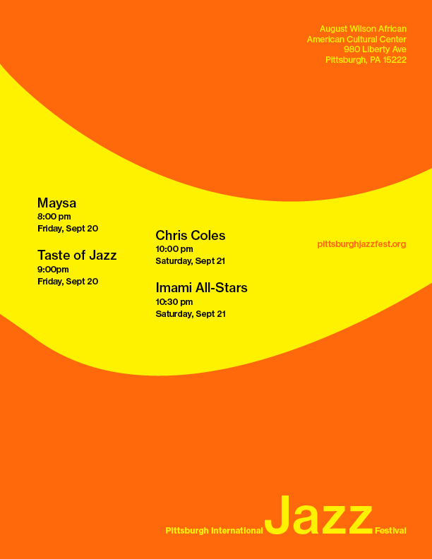
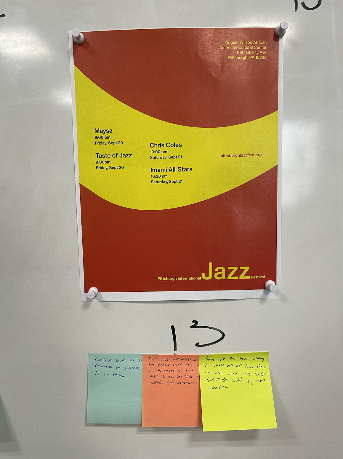
This is the poster that I brought to class for critique. In the poster, I used a more organic banner to show movement, and bright colors to emphasize the lively nature of Jazz. I also used contrast in scale in the name of the festival to clearly show the subject of the festival, which is Jazz.
I got two main pieces of feedback on this poster. First, the alignment of the text in the banner was a bit random, and did not clearly convey that the groups of events on the same day were related to each other. I also saw that whitespace on the poster was effective at drawing attention to it when it was situated among a full bulletin board of other posters.
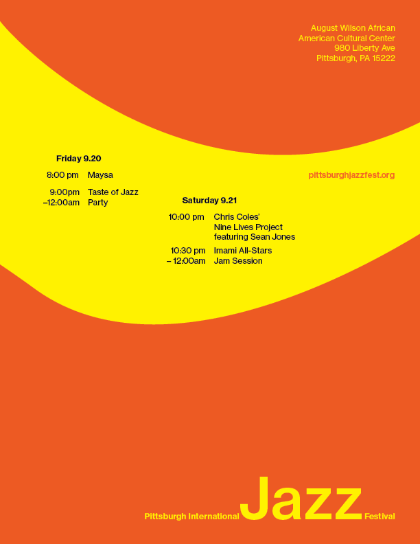
To incorporate these findings, I made a few changes. First, I ordered the events differently, so that they were more grouped by their dates. Second, I moved the banner with the text slightly upward, in an attempt to increase the whitespace under it. I did not find a good way of making the spacing between groups more neat. In a way, the vertical unevenness between the text blocks also conveyed movement. The text was all aligned in columns, with a 12-column grid. I also used a slightly lighter color, as I thought the previous version was too red.