Introduction
In this assignment, we are to research a website for our local food bank, and redesign their digital communications to more effectively communicate to a group of stakeholders. The food bank that I chose to work on is Food Lifeline, a food bank that serves the Western Washington region.
Exercise 1: Familiarize & Define Your Audience
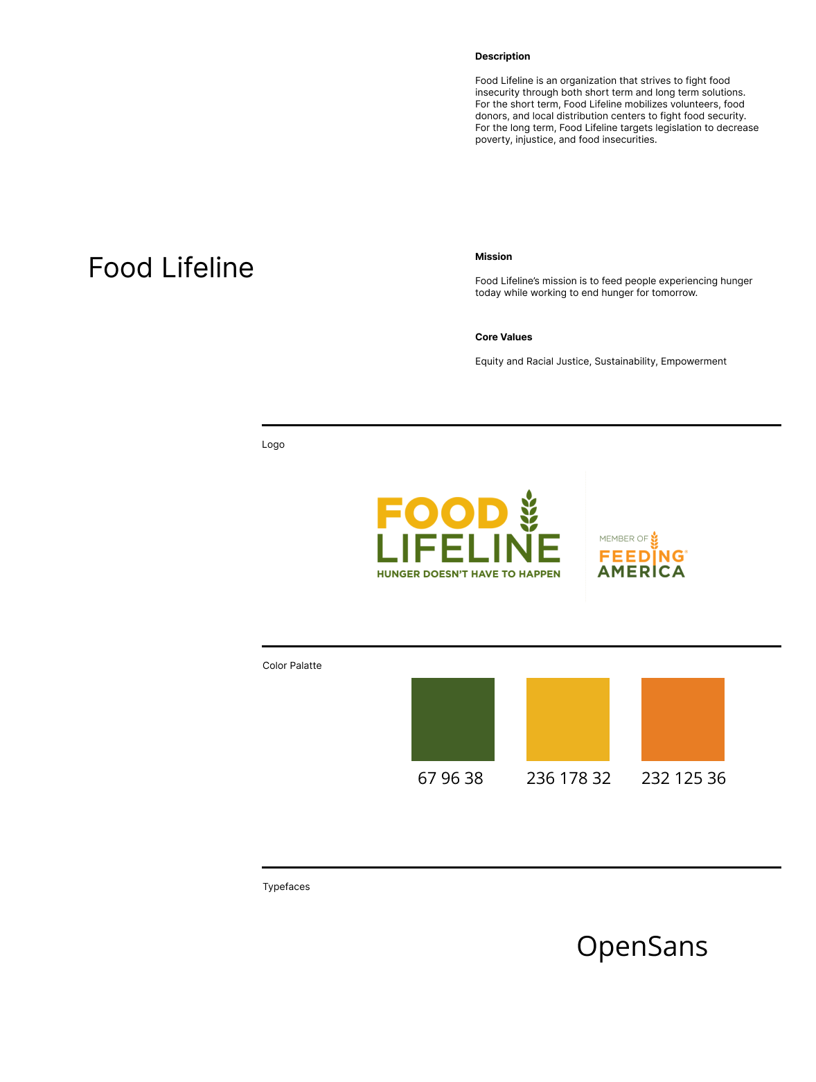
Before thinking about redesigning the website, I first gathered some information about the food bank, including their scope, mission, and people and organizations they interact with. Below is some of the key information I gathered:
Mission Statement:
Food Lifeline’s mission is to feed people experiencing hunger today while working to end hunger for tomorrow.
Scope:
Food Lifeline has two major focus points. The first is providing food to those suffering food insecurity. The second is changing legislation around food insecurity through community engagement and advocacy.
Stakeholders:
There are many different types of users who will be interacting with Food Lifeline, who can be categorized into three groups:
-
individuals
- advocates
- volunteers
- donors
-
corporations
- food donors
- volunteer groups
- sponsors
-
recipients of food aid
PDF of more detailed notes: notes
Besides exploring the website, I have also signed up for two newsletters - one for volunteers, and one for advocacy. At the time of writing, I have yet to receive a newsletter from either mailing lists.
After scouring the website for information about the website, I transitioned to researching the design of the website. Below is a brand guideline framework for the current website:
Exercise 2: Brand Type Analysis
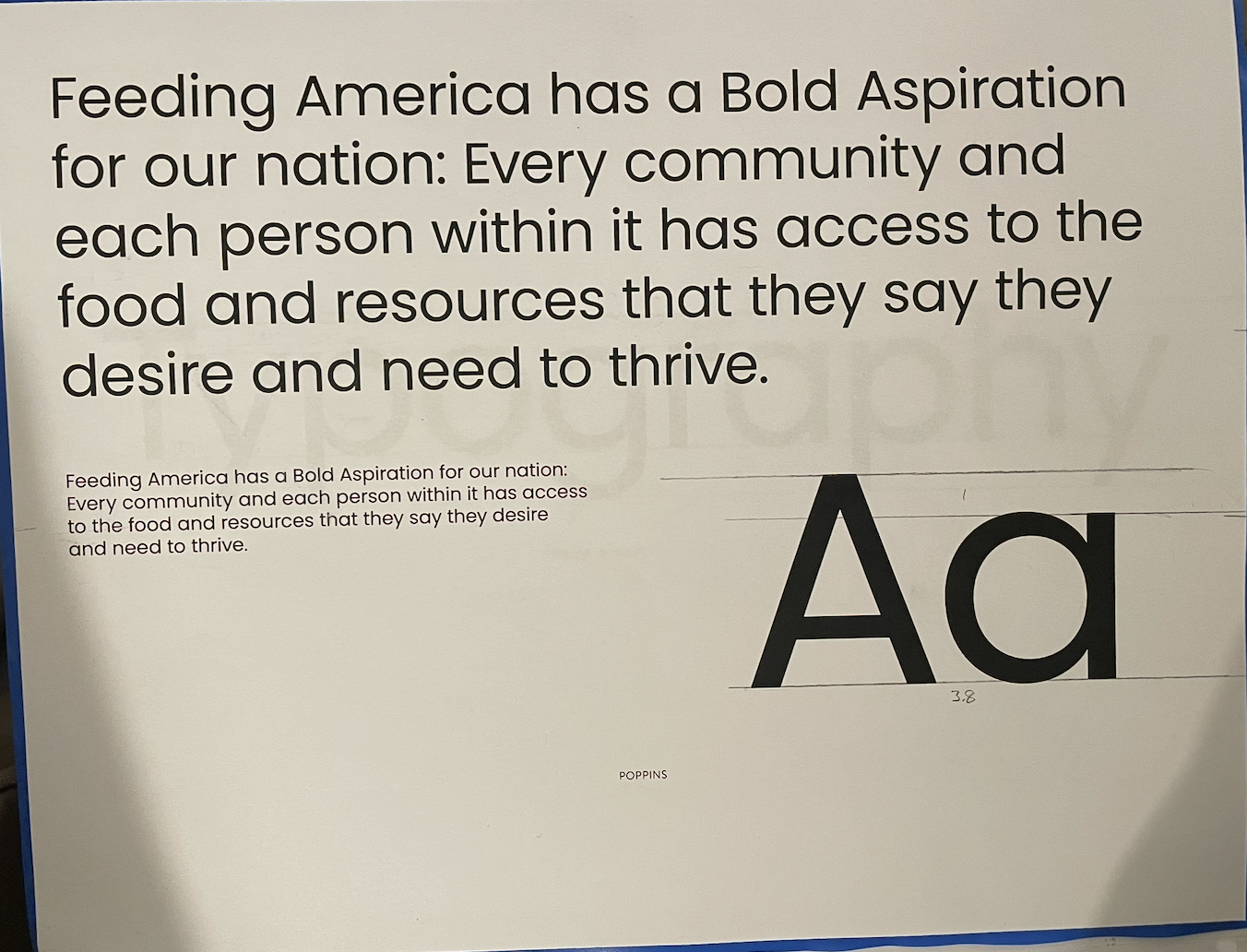
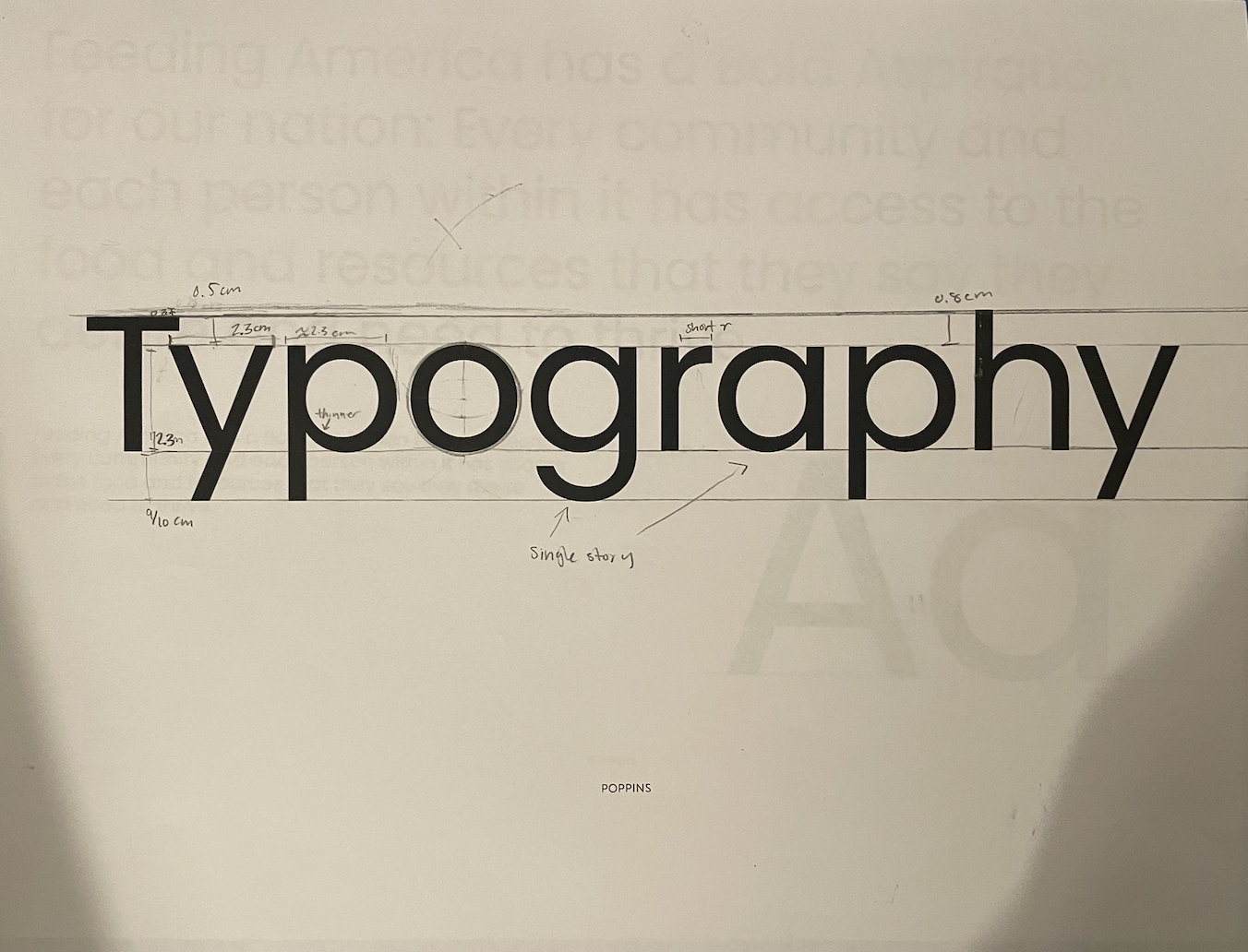
For this assignment, I analyzed Poppins, one of my website's primary fonts. I looked at the proportions and the overall vibes of the font. The font is very uniform with a low cap-height to x-height ratio, and very round circles. This gives it a clean, professional feel. The g's and a's are both single-story, which makes it elegant and simple. Even though the font is very professional, the round-ness makes it friendly and approachable. Below are images of the lines I drew to analyze porportions:
Exercise 3: Competitive Analysis & Gathering Content
For this assignment, I explored a few of the newsletters in my inbox, and analyzed what was effective and ineffective about each. In this section, I will walk through the analysis of two newsletters, as well as the newsletter I received from Food Lifeline.
This is a newsletter from the Art Gallery of Ontario, which I visited over spring break. This newsletter is very elegant. It features a solid color header, and implements the same structure for each section, which promotes clarity. One aspect of this newsletter that I incorporated into my mobile design was putting the image before the title. This serves to draw in the reader's attention before they see the actual content.
One thing about this design that was not particularly effective was the spacing between the button and the sections. The button is very close to the text, which impacts legibility, and is also close to the next section, which also makes grouping less clear.
This is a newsletter is from the Carnegie Library of Pittsburgh. The sections have solid color backgrounds, and are separated by whitespace between the color. The section at the end, with upcoming events, has a different color background to convey the change in type of content. This newsletter also uses images to draw readers in before getting to the actual content. There is more whitespace in this newsletter than the previous, which made viewing easier for the eyes. This newsletter was pleasant to peruse and effective in communicating its messages.
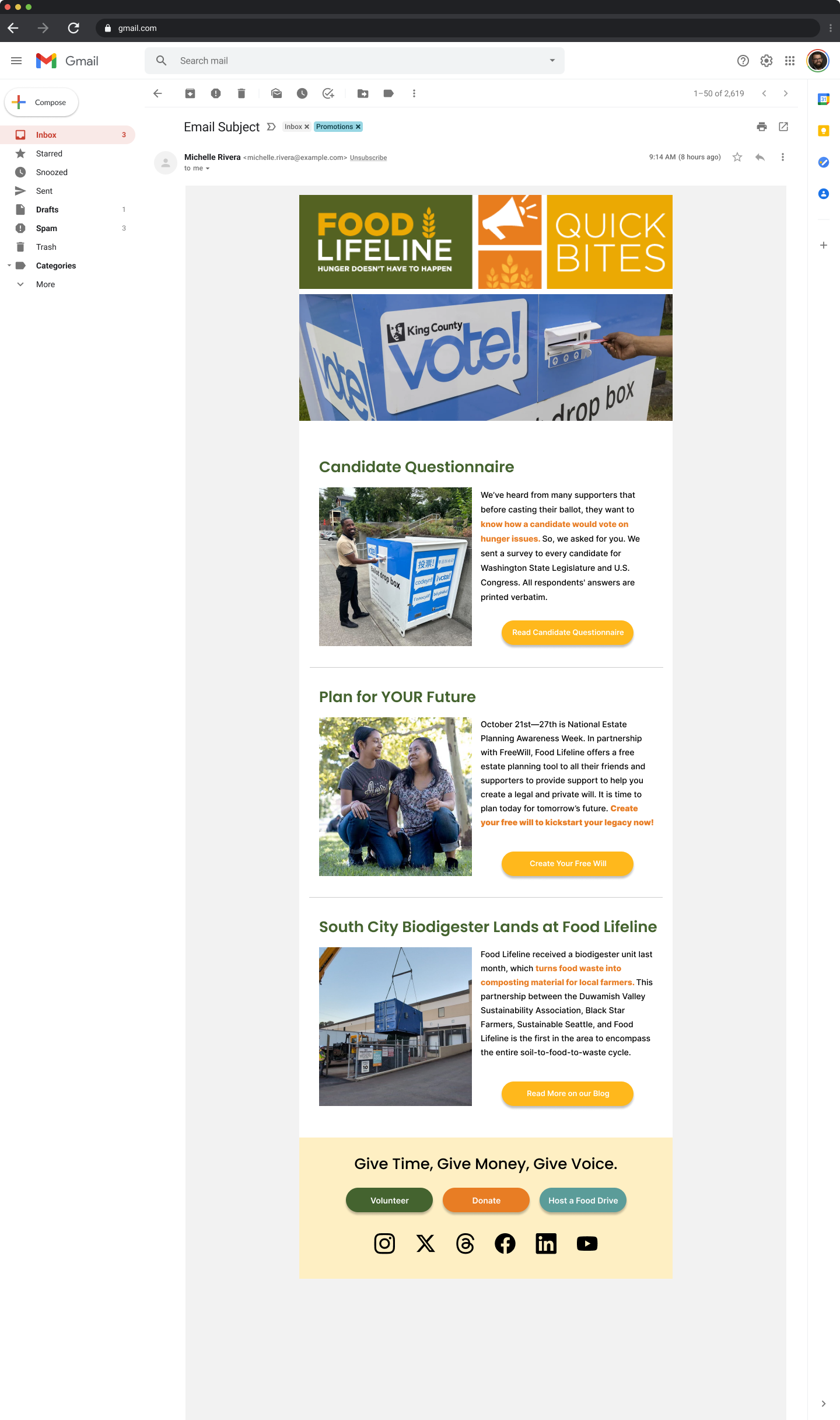
This is an edition of the current newsletter that i received from Food Lifeline. The table of contents is a good idea, but is implemented poorly. It is also unneccessary, because the newsletter is in a way already a table of contents for their other communications.
Aside from the table of contents, the newsletter is very similar to the previous two. It has unity between sections, and has sufficient cues to indicate section breaks (lines and whitespace). The footer also had many text links, which I am planning to redesign to make more concise.
Exercise 4: Wireframe / Draft E-Newsletter
In this exercise, I thought about what audience I wanted to focus on, and then drafted a mobile prototype targeted toward this audience. I chose to target toward a broader audience of all individuals who interact with Food Lifeline - Those who volunteer and those who receive aid. I decided that I wanted to focus on calls to action, so I focused on stories that included an action for users to take. Below is the first iteration of my prototype:
Exercise 5: Iterate & Document Process
After my first prototype, I received feedback on this prototype, and continued to iterate on it. Below are a few selected iterations, along with brief descriptions of the changes made throughout.
The feedback I got for my first prototype was that my use of center-aligned text was excessive. For my second prototype, I experimented with left-aligned and justified text.
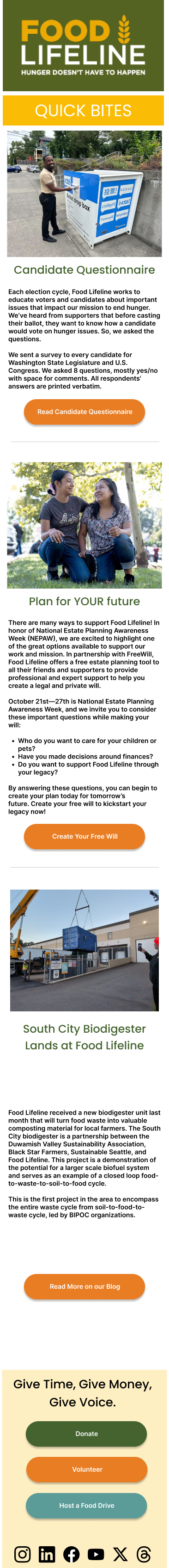
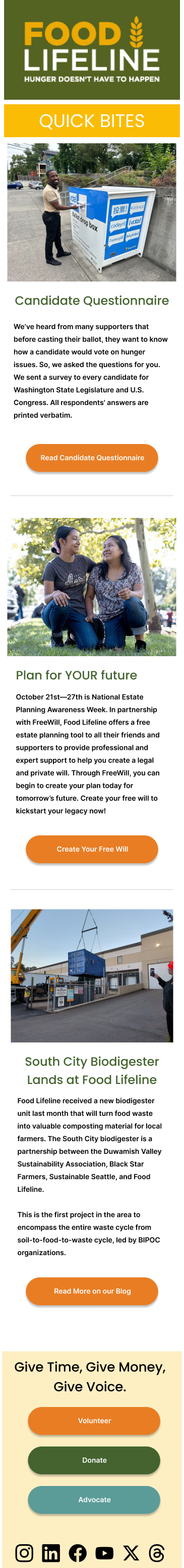
For this iteration, I chose to stick with left-aligned text, because the justified text looked messy. I also pasted in the images, titles, and content from the newsletter. I cut down on some text and chose some of my own images, but for the most part kept the original content. I also added a footer. On this iteration, I received feedback from my peers and from my instructors. Some feedback that I got was to switch the order of the buttons in the footer to match the slogan better; to remove the white in the logos in the footer; and to increase spacing between text lines; to decrease the amount of text. In my final iteration, I implemented most of this feedback.
This was the first iteration of my desktop design. Some feeback I got was that there was too many words, which made it difficult to skim through. In my final iteration, I emphasized one sentence in each of the sections in an attempt to provide something for the eyes to land on.
Final Reflections
Overall, this assignment was very stressful. The deadlines seemed very rushed, although it might have been because my other classes were also busy. The software was also difficult to deal with at times. However, because we had a lot of references, including the newletters we have in our inboxes and the original newsletter, which made it a bit easier to get going. Overall, although the process was stressful, I was the most pleased with my final product for this project out of all three projects so far.