This is the final project of the semester. For this project, I chose to make a complex editorial system for the introduction of The Four Loves by C. S. Lewis.
For this assignment, I had to choose a topic that I was interested in or passionate about, and find a text about it. At the end, I settled with The Four Loves, because it was about a topic I am interested in, and it was a rather accessible and easy text to find.
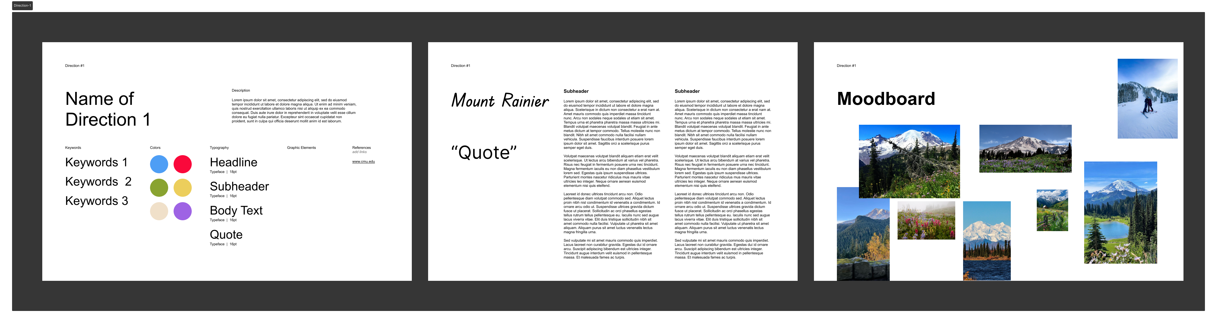
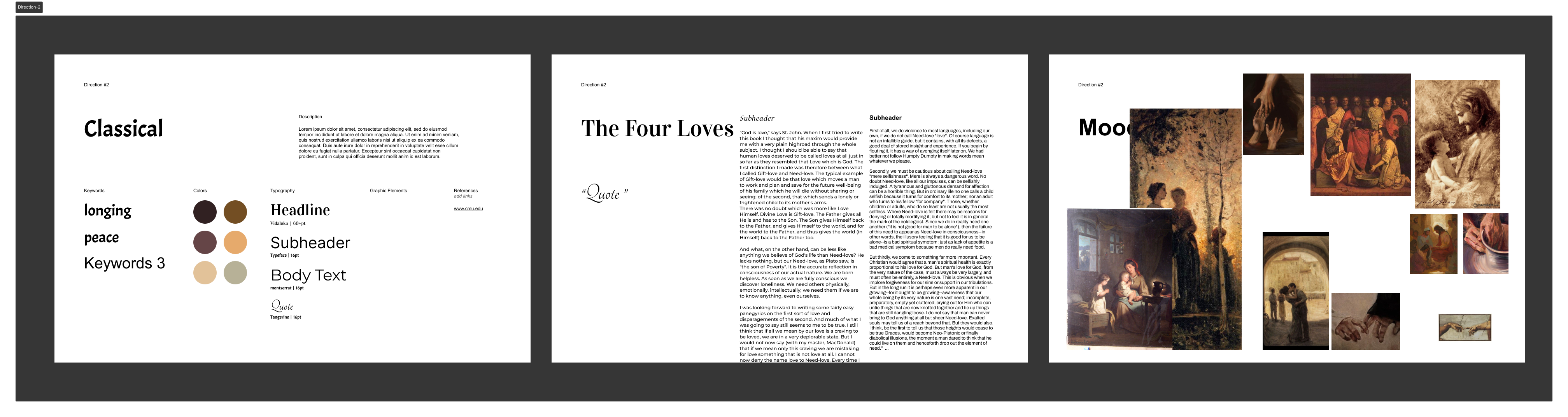
In this assignment, I developed moodboards for the two topics I was considering (We were supposed to develop two separate moodboards for one topic, but I missed the memo).
The first moodboard I made was for Mountain Rainier. I wanted to capture the beauty of the mountain, as well as the versatility and diversity of it. Below is my moodboard and palette:
The second moodboard is for the introduction chapter of the book The Four Loves by C. S. Lewis. I wanted to capture the intellectual nature of the text, as well as the beauty and intimacy of the love he writes of. Below is my moodboard and palette:
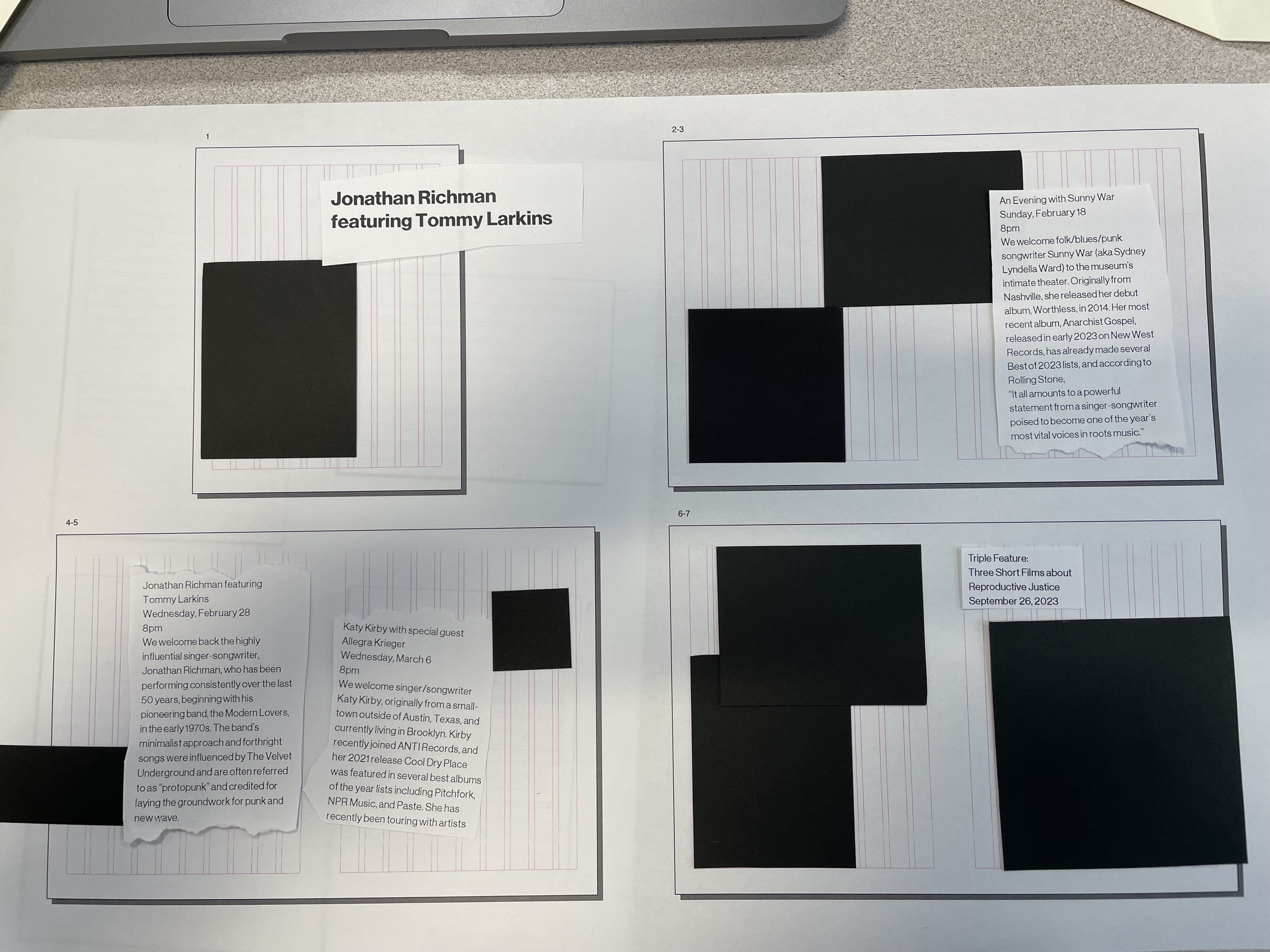
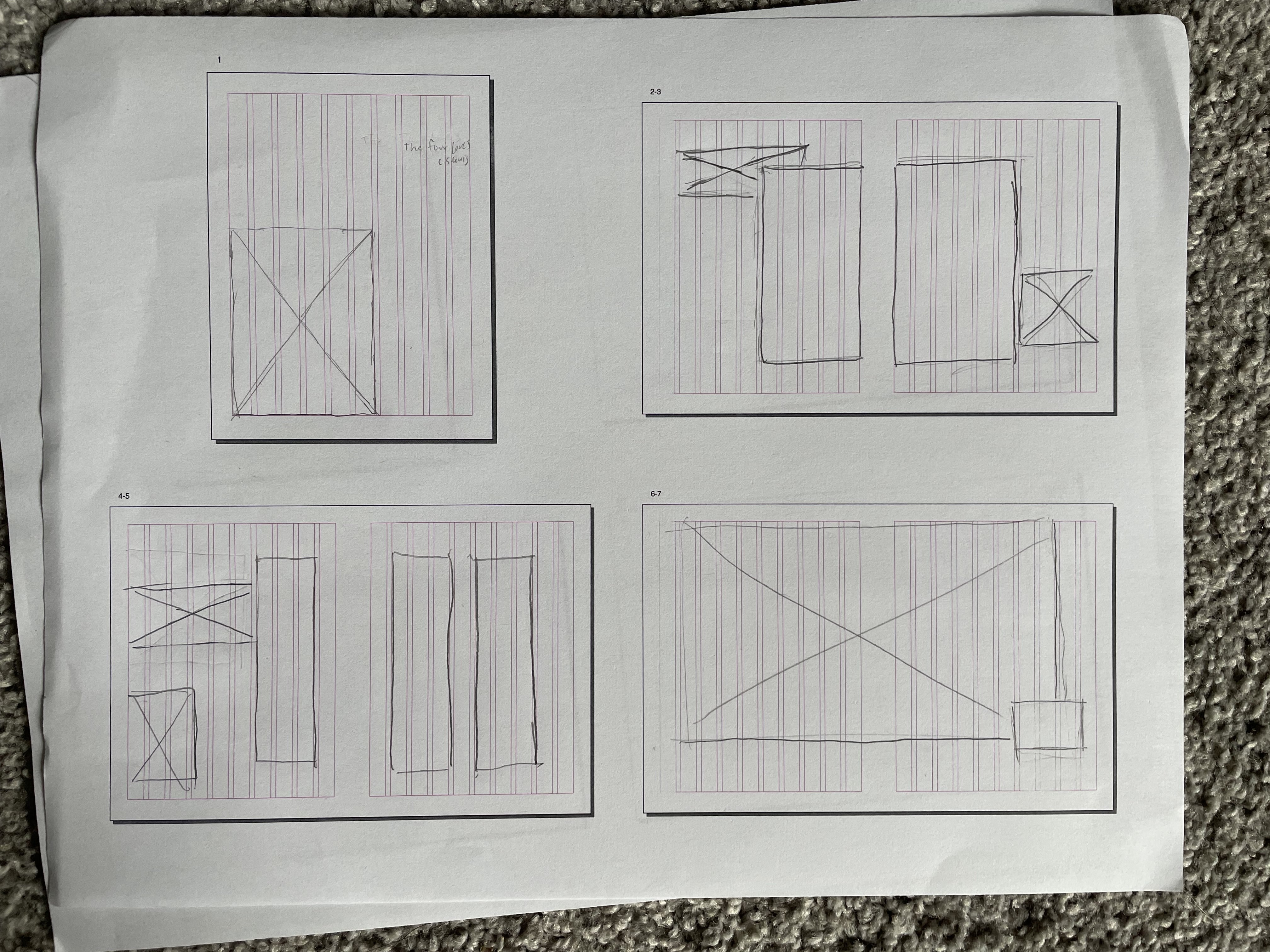
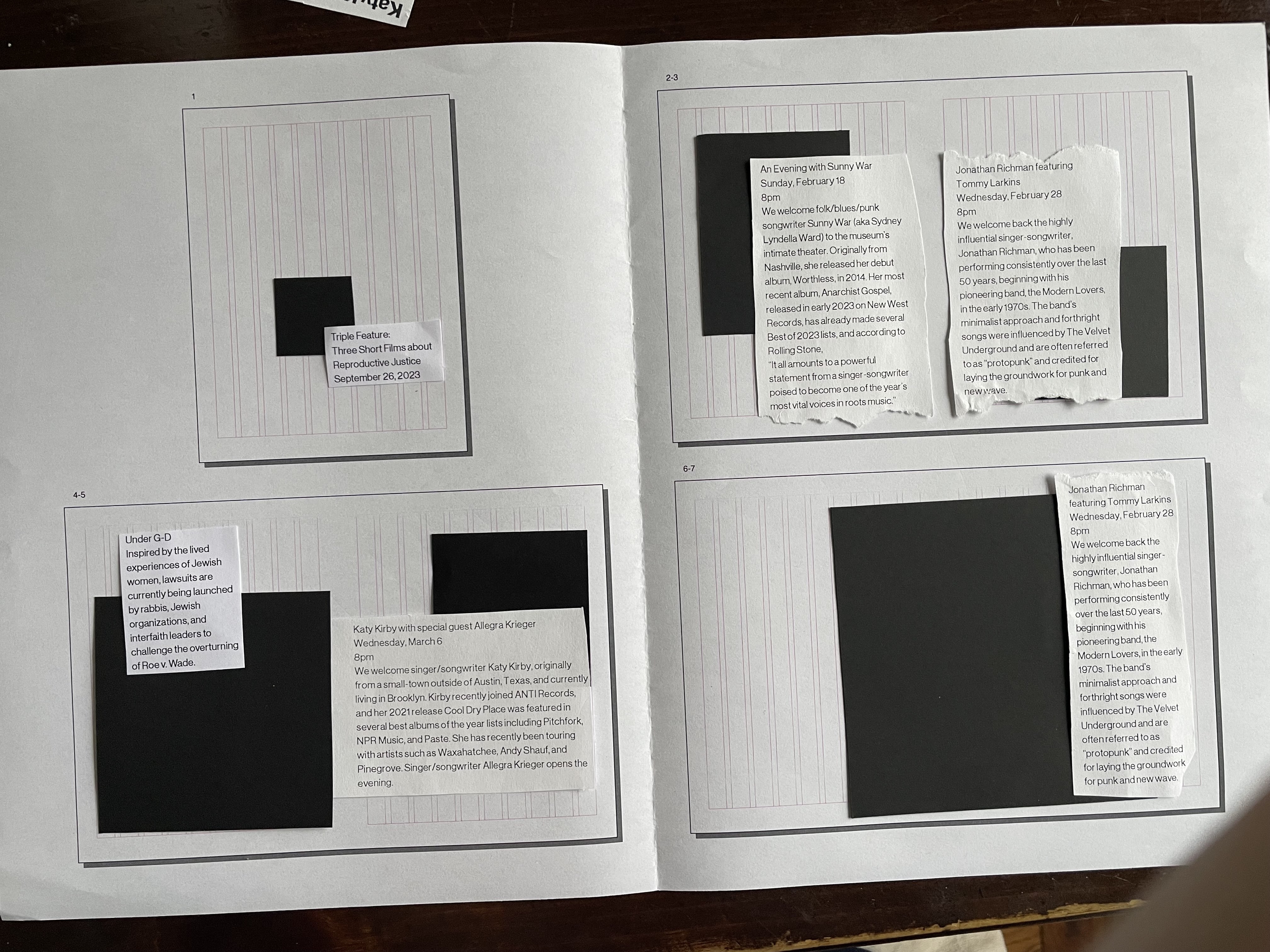
In this assignment, I sketched a few thumbnails for my spreads. I wanted to keep the text together so that there would be more space for more powerful images. I also experimented with other layouts and column counts with the shape and text cutouts. Below are a images of a few designs I created.
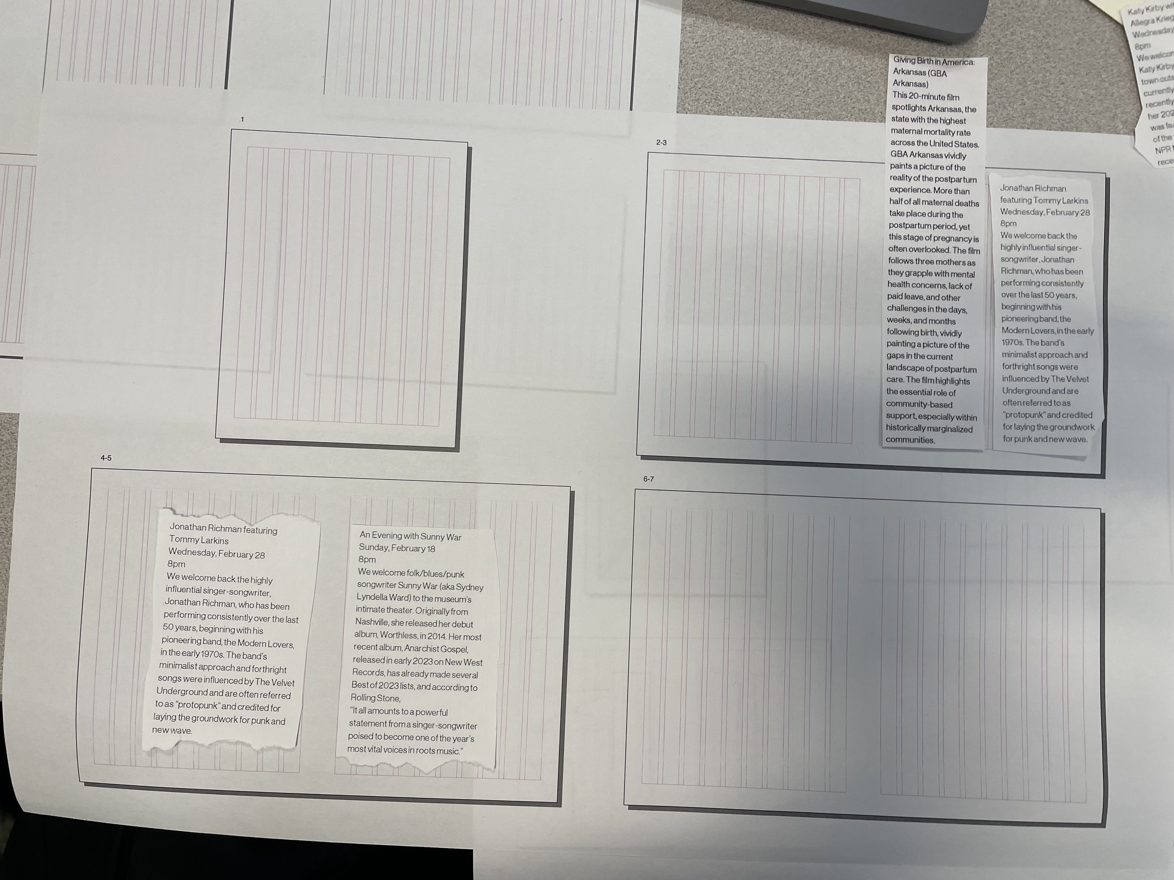
In this assignment, I learned how to flow my article, and began drafting layouts with my images. I realized that there was a lot of text, which made it difficult to create space and still include all the content. In the next iterations, I will work on using the grid to make the images and text more cohesive. Below is my first draft:
After getting peer feedback on my first draft, the biggest takeaway was that my text blocks were too wide, and too large in general, which made it intimidating and difficult to read.
Outside of breaking up the text boxes, I also focused on connecting the images with the text better, and using whitespace to also enhance readability of my article.
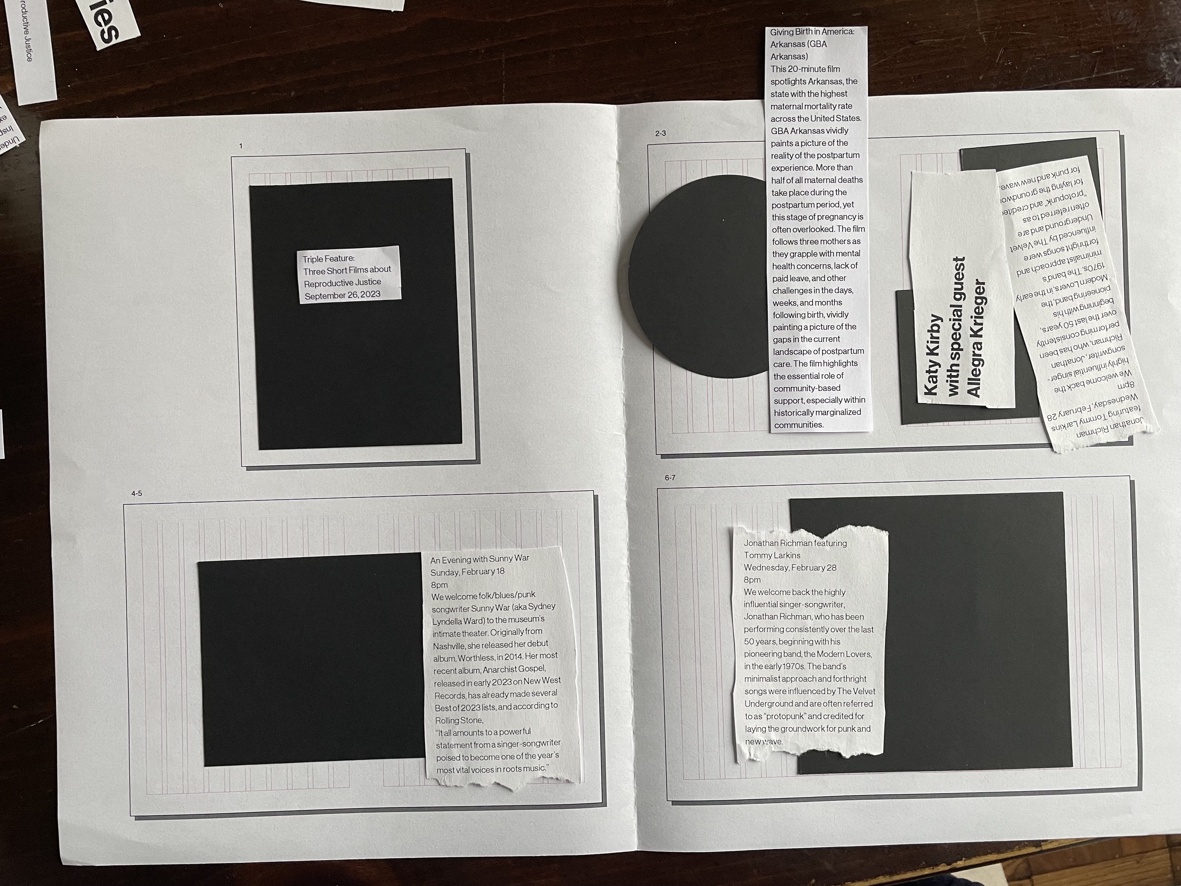
After creating my second draft, I got some feedback from my professor, that I could try making the background a lighter color, as the brown was very intense and took away from the images. I implemented this feedback for draft 3, and decided to stick with it for my final.
Below are drafts 2 and 3:
In this assignment, we began working on the mobile version of our editorial. I decided to keep it simple, with images intermittenly placed between sections of text. Because my text did not have sections, I chose a few spots where a break made sense, and place an image that relates to something in the section, along with a quote from the section that relates to the image. This way, readers can get a few key quotes from scanning the article, and the article doesn't seem too tiring to read, as there are breaks between sections. Below is my article in digital form:

For my final spreads, I stuck to the light-colored background. I made the cover a dark background. I tried using generative-fill to expand the image into a dark background; it worked ok. The images I chose represent each kind of love - familial love, friendship, romantic love, and charity love. The tree connects to the metaphor Lewis uses to describe love. The sunlight on the last spread, which is not very present elsewhere, represents the goodness and splendour of divine love.
Before beginning this project, I was very excited to get to choose a topic and a direction for my work. Seeing the projects from previous years was also very cool. However, as I got going on the project, I realized that it was gonna be a lot harder than anticipated to make something that I was satisfied with. By the end, however, after quite a few iterations, the designed was finally somewhat presentable. Through this process, I learned about the importance of iterating, and also how to use grids and color to make a project cohesive.