Also my First Webpage 🙂
Near the end of the Russian Empire, Sergei Mikhailovich Prokudin-Gorskii sought to document scenes from his homeland. Although he currently had no method of visualizing these images in full color, he still managed to at least record full color information by using colored filters to allow only certain wavelengths of light to enter the camera. Here, we will explore methods of aligning the three separate channels to visualize Gorskii’s scenes in full color.
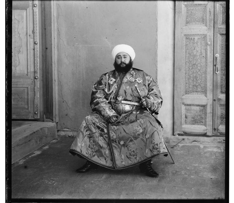
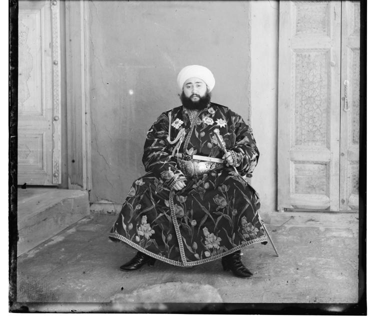
Gorskii’s images were recorded in sets of 3: one each for blue, green, and red light.
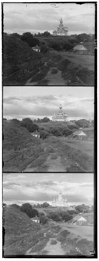
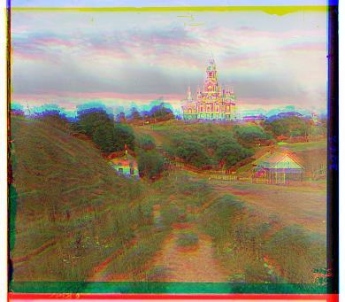
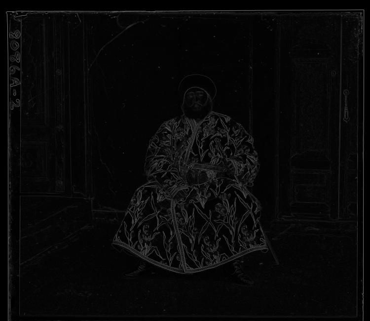
Simply overlaying each of the three images on top of each other quickly shows that they are not properly aligned:

We can find a simple alignment by sliding the channels over each other and computing the Sum of Squared Distances between the pixels to find the “best” aligment:
 - I_2(x,y))^2")
This optimization can be very costly if run exhaustively over large images.
To mitigate this, we can define a recursive method that operates on a pyramid of downscaled versions of the image to find the starting point for an exponentially smaller search window in the full-size image.
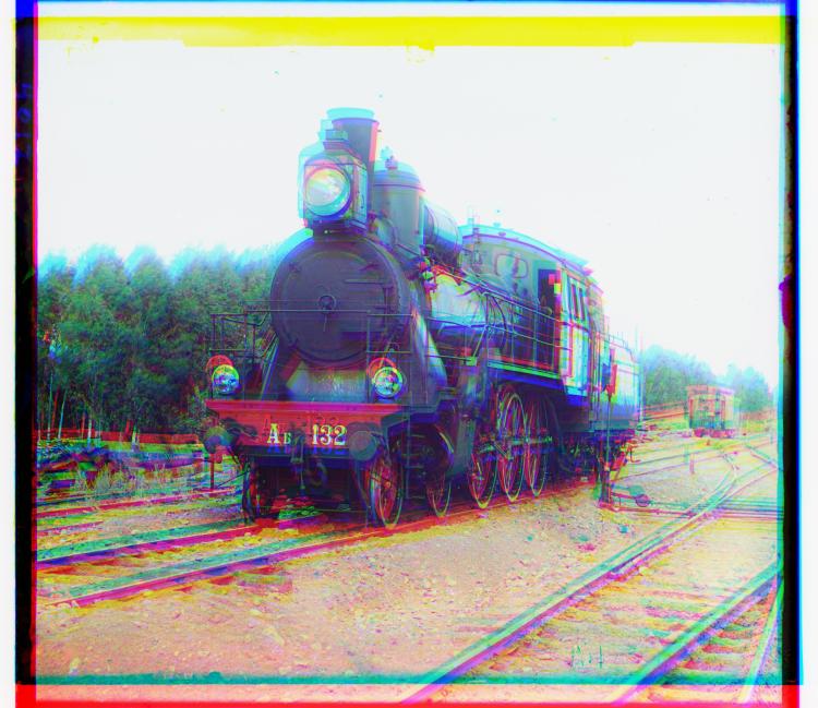
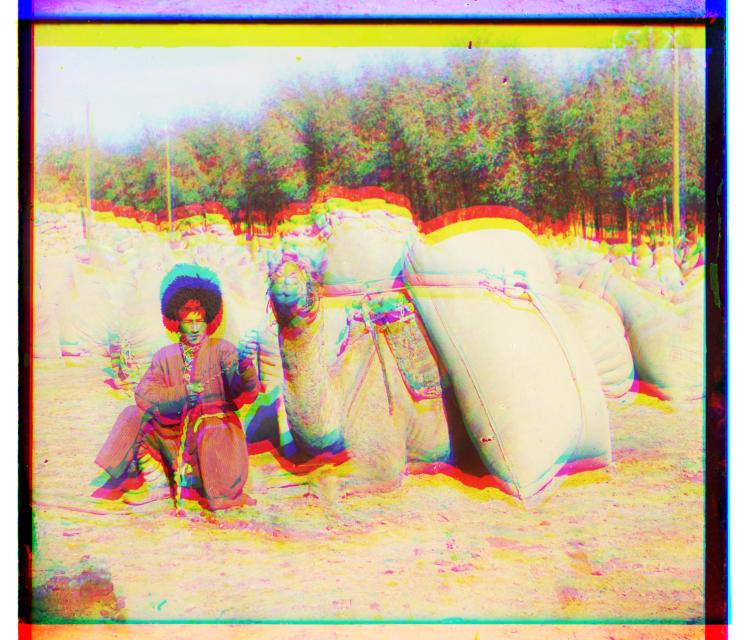
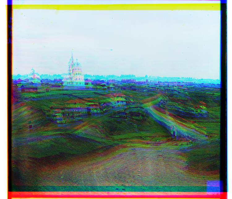
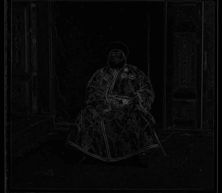
Results of this naïve approach and their corresponding offsets are found below.
Red Shift: (12, 3) Green Shift: (5, 2) 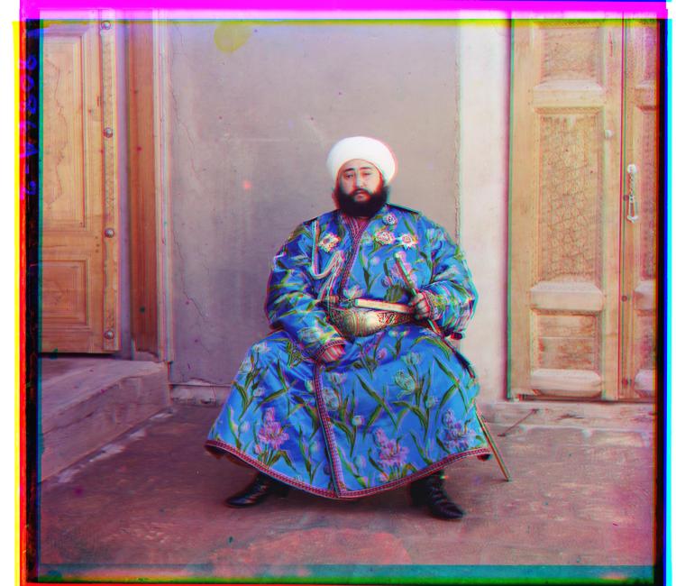
Red Shift: (103, 57) Green Shift: (49, 24) 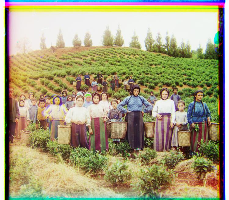
Red Shift: (124, 13) Green Shift: (59, 16) 
Red Shift: (90, 23) Green Shift: (41, 17) 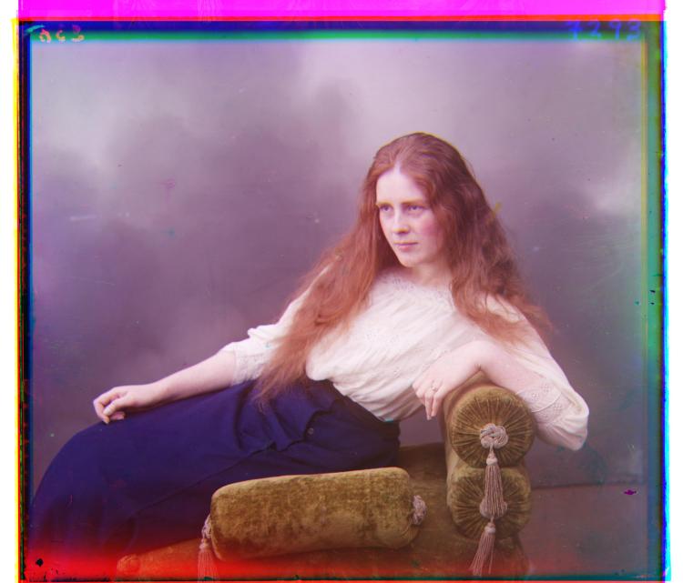
Red Shift: (116, 11) Green Shift: (56, 8) 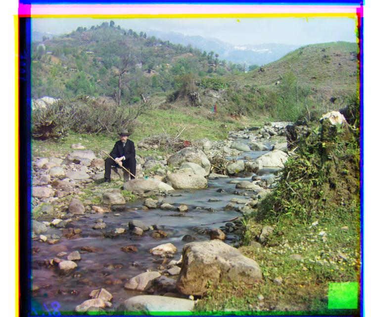
Red Shift: (176, 37) Green Shift: (79, 29) 
Red Shift: (112, 11) Green Shift: (53, 14) 
Red Shift: (87, 32) Green Shift: (43, 6) 
Red Shift: (116, 28) Green Shift: (56, 21) 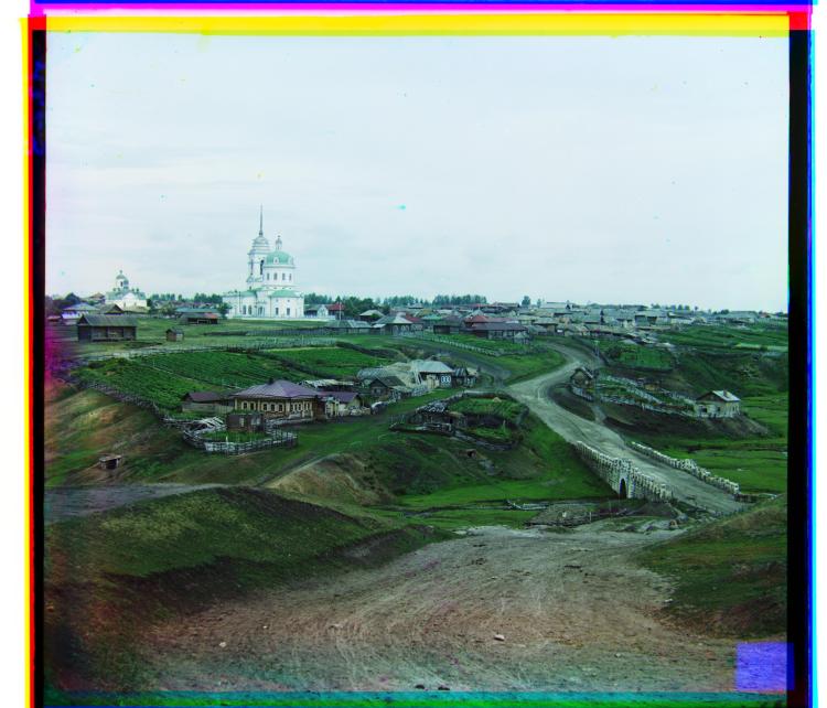
Red Shift: (138, 22) Green Shift: (65, 12)
Comparing Gradients
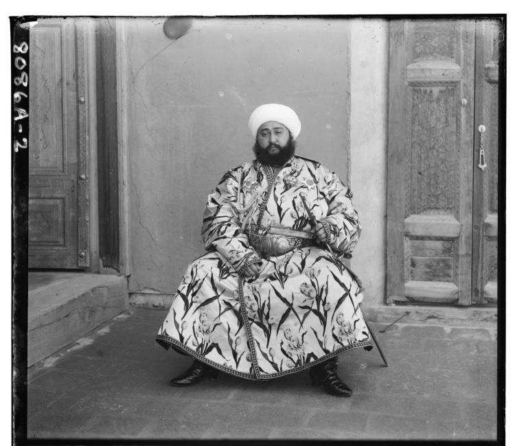
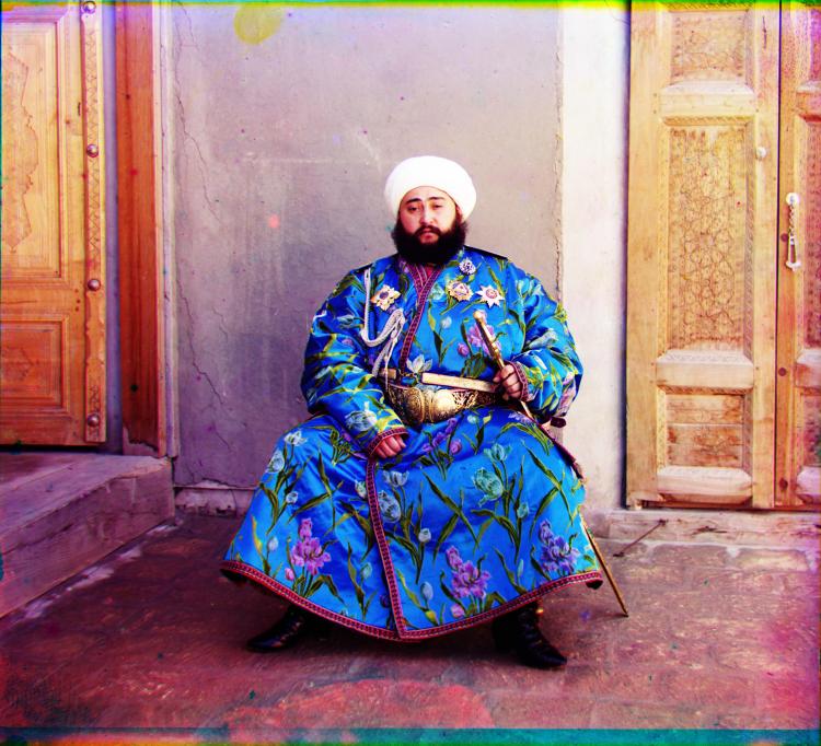
However, this naïve approach can fail when the color channels disagree too much i.e. in cases where one of the primary colors is very prominent.
To handle this, we can instead look at the SSD of the gradients of the color channels:
\\\\ \frac{\partial I}{\partial y} = \left(I * \begin{bmatrix}-1 & 0 & 1\\-2&0&2\\-1&0&1\end{bmatrix}\right)\\\\ \|\nabla I\|_2 = \sqrt{\left(\frac{\partial I}{\partial x}\right)^2 + \left(\frac{\partial I}{\partial y}\right)^2}")
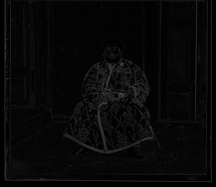
This yields better results on images where the color channels tend to disagree:

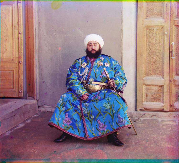
The Naïve approach worked poorly on Emir, likely because of how blue his garb is. In the above comparison, you can tell (especially in his face) that the Gradient method gave a much better alignment. By analyzing the gradient instead, we focus on change rather than intensity of brightness, allowing for a much better registration.
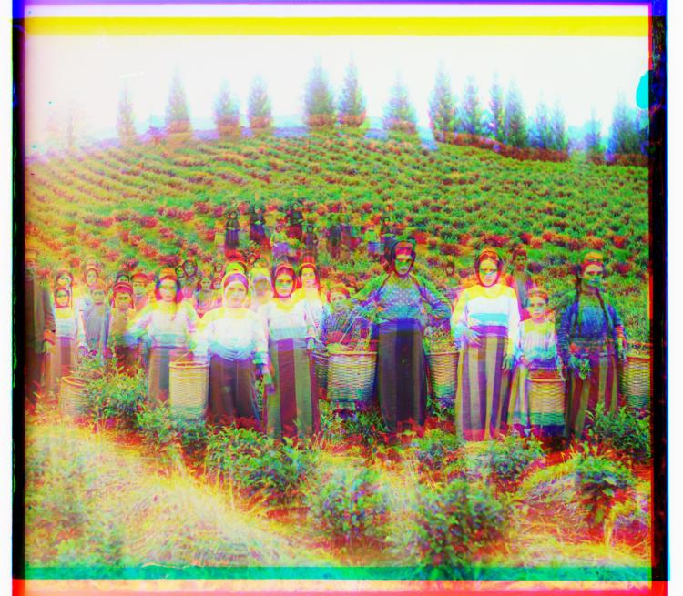
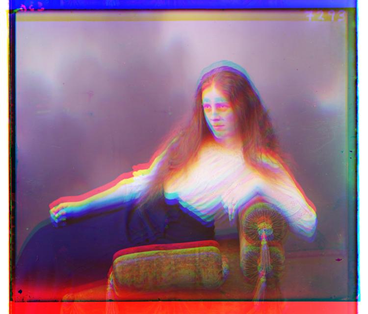
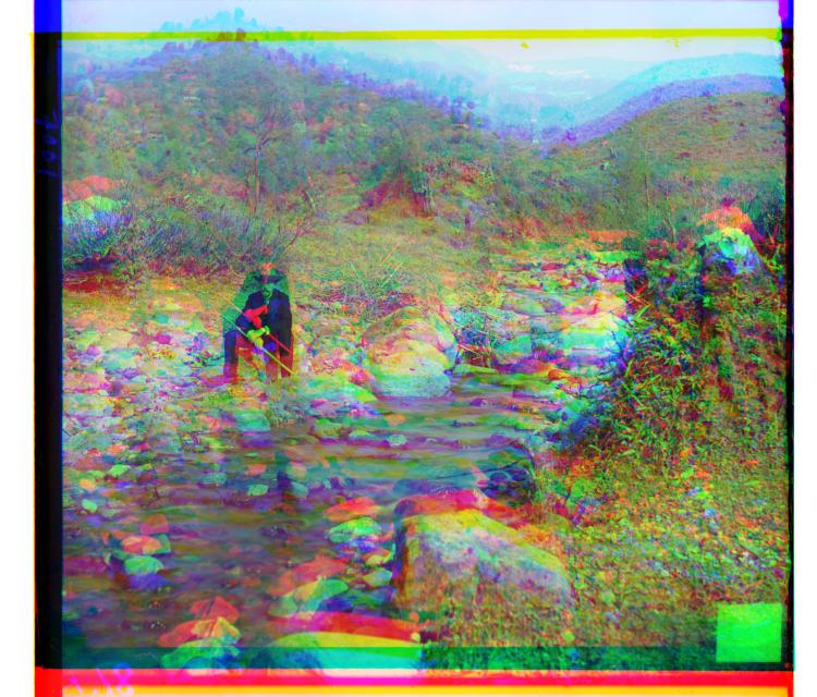
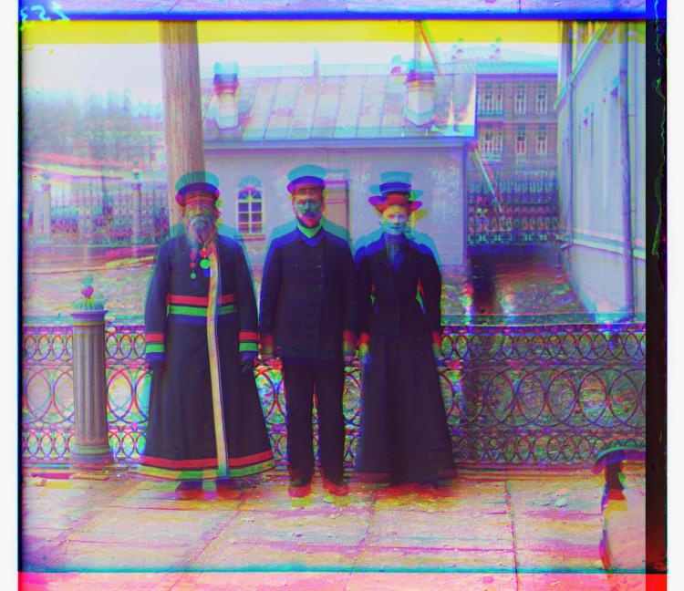
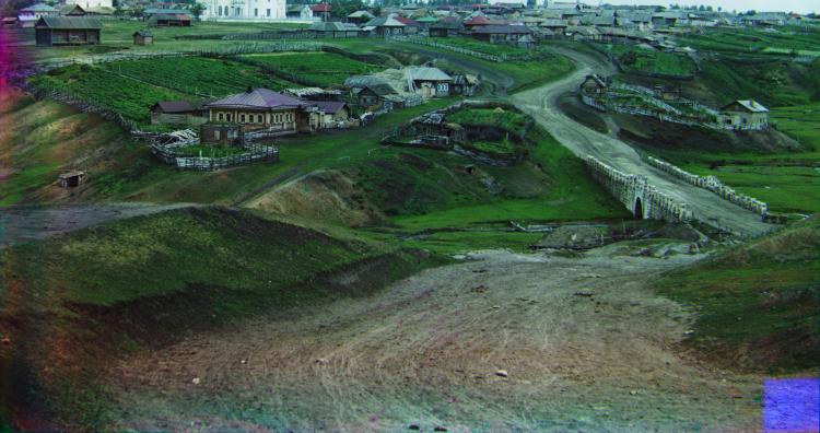
Results and offsets of other images are found below.

Red Shift: (12, 3) Green Shift: (5, 2) 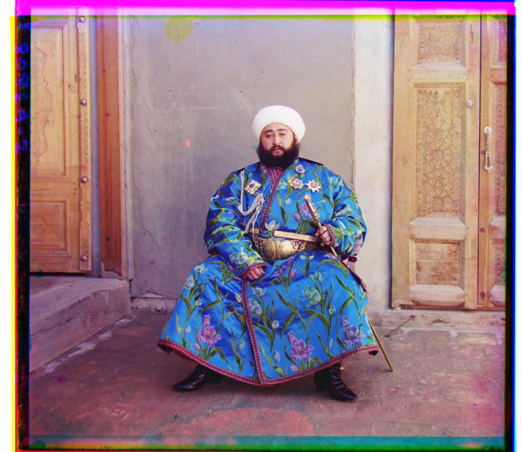
Red Shift: (107, 40) Green Shift: (49, 24) 
Red Shift: (124, 14) Green Shift: (60, 17) 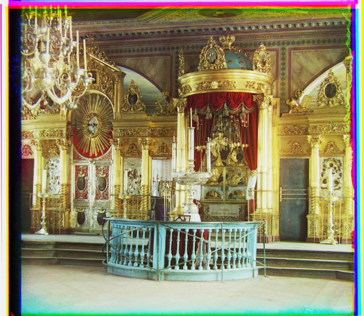
Red Shift: (90, 23) Green Shift: (42, 17) 
Red Shift: (120, 13) Green Shift: (56, 9) 
Red Shift: (176, 37) Green Shift: (78, 29) 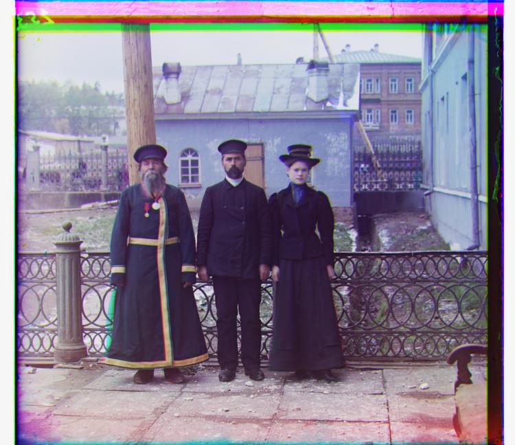
Red Shift: (111, 9) Green Shift: (54, 12) 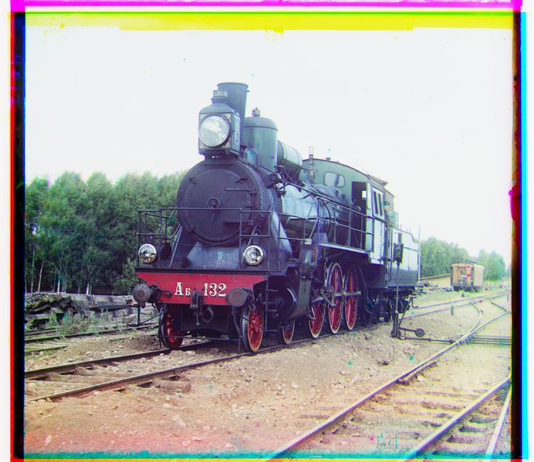
Red Shift: (85, 29) Green Shift: (41, 2) 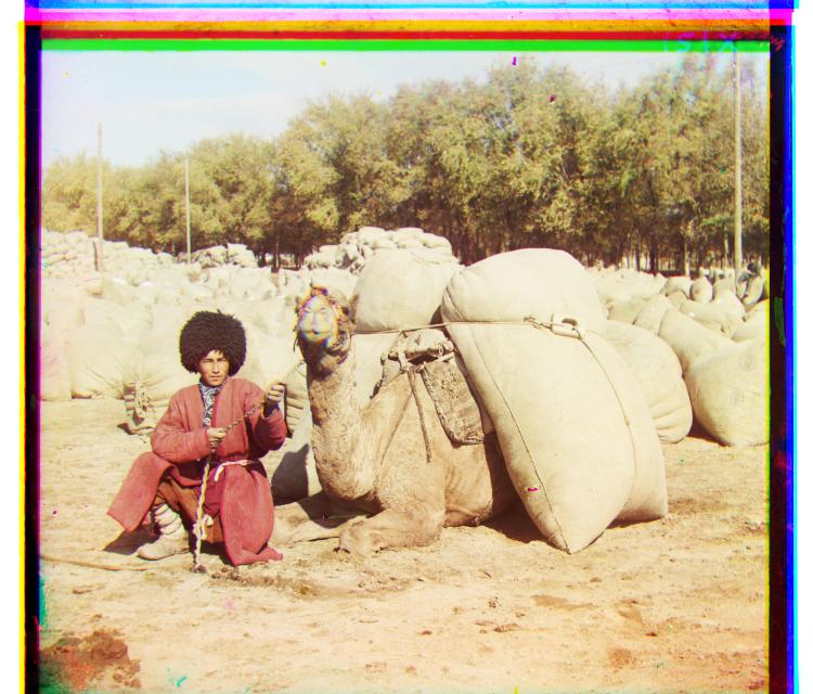
Red Shift: (117, 28) Green Shift: (57, 22) 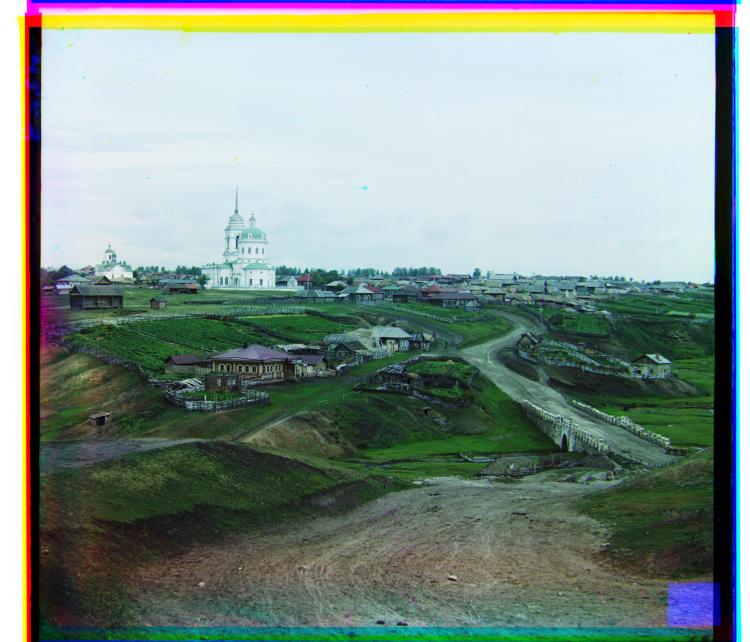
Red Shift: (137, 21) Green Shift: (64, 10)
Automatic Cropping
When these images were scanned in to digital format by the Library of Congress, border artifacts were included in the files. Black borders from the positives themselves surrounded by white borders from the scanning surface distract from the content of the colorized image themselves.
Here, automated cropping was done by looking at the median pixel values of an outside row or column. If the median value was above (white point) or below (black point) a given threshold, the row or column was cropped out. The gradient was also considered to determine if the row or column was truly part of a border artifact.
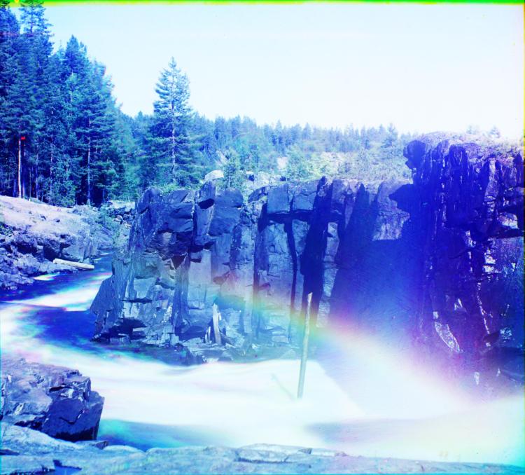
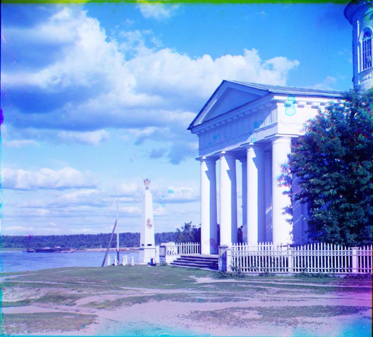
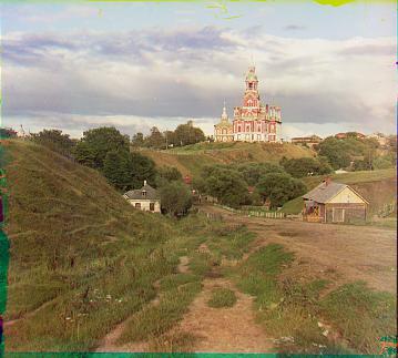
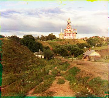
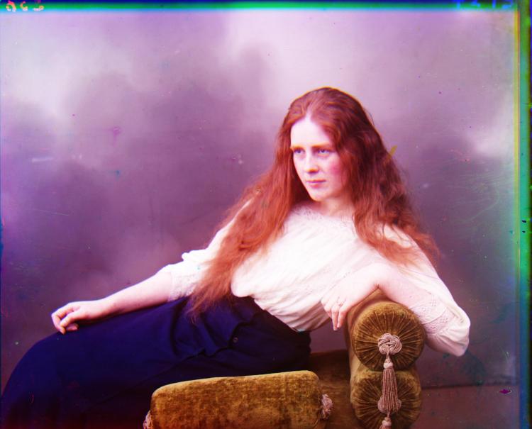
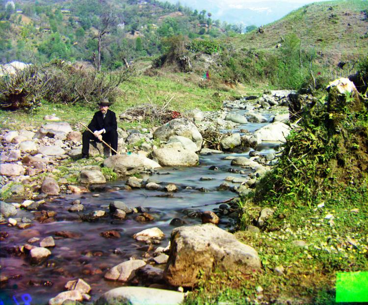
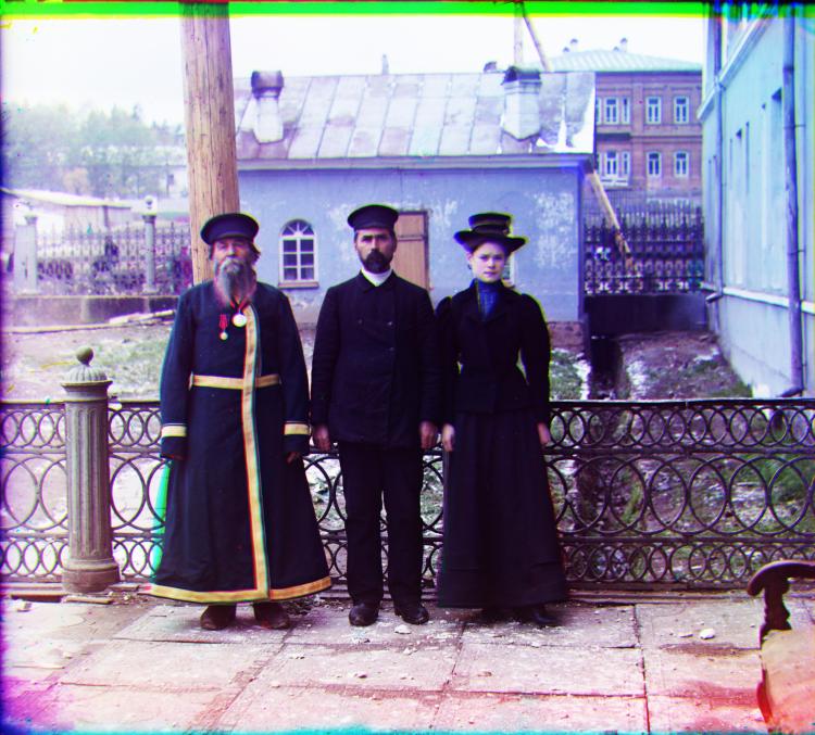
Cropped images are found below.

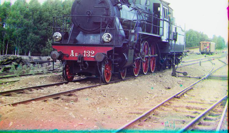
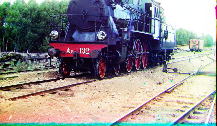
The automatic cropping worked well for all images except for the train. Unfortunately the sky (top portion of image) was very smooth (small gradient) and nearly the same color as the white scanning backdrop, making it very hard to detect as not part of the border. Further hard coding could have been implemented, but that would ruin the spirit of the automated cropping.
Enhancing Contrast
Many of the recolonized images seem rather washed. To enhance the contrast, we can use a scalar function that maps the domain [1, 0] to the range [1, 0]. The following function satisfies this condition and spreads out values near the center without saturating values near the boundaries:
 = -0.5\cos(\pi x)+0.5")

Applying this function to our images increased the contrast and made them seem much more vibrant. Cropped images with our contrast map applied are below.

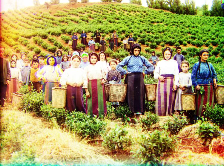
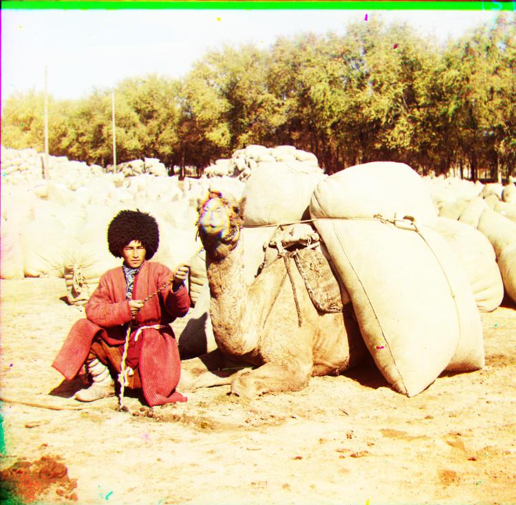
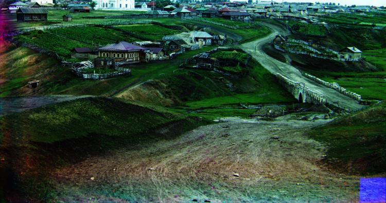
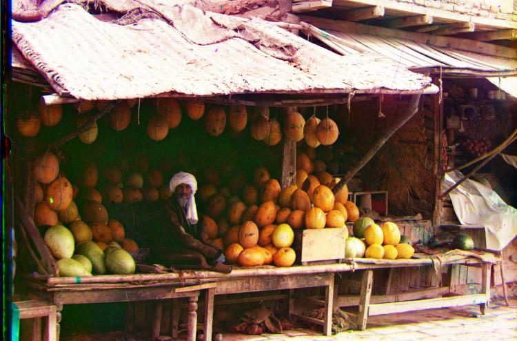
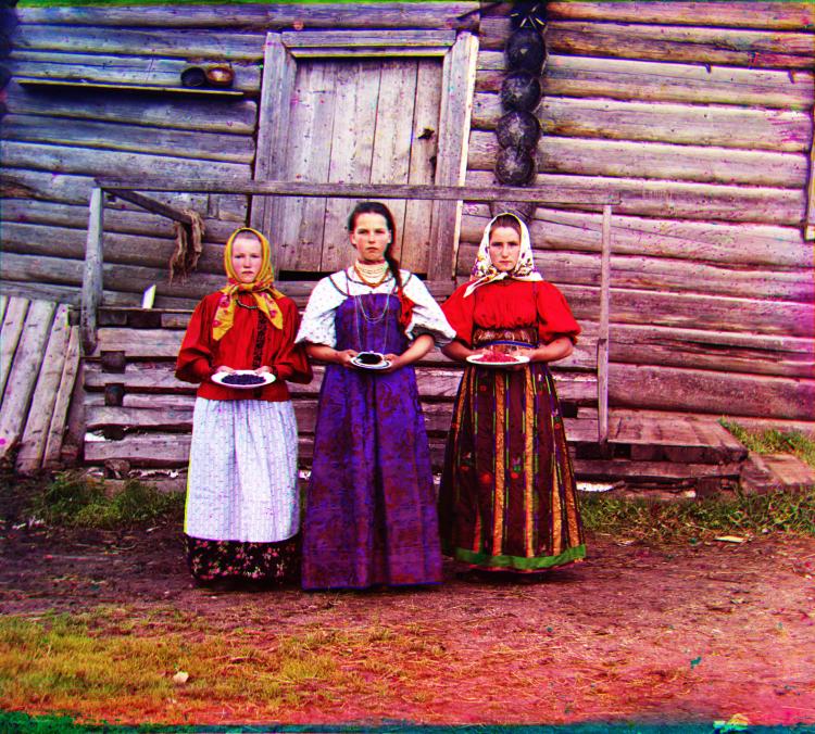
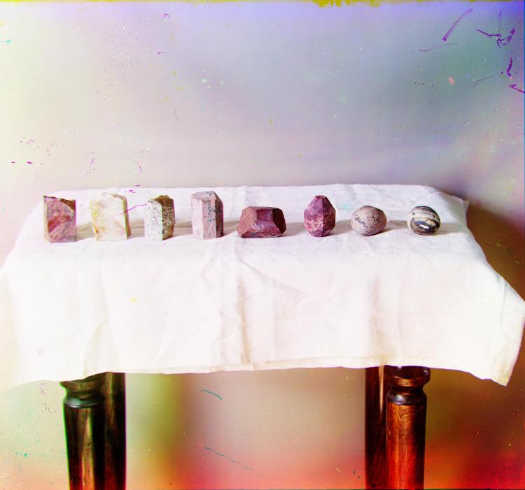
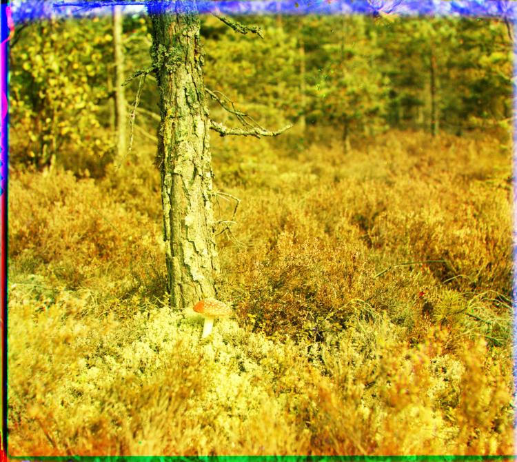
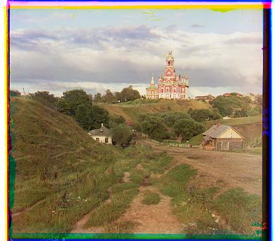
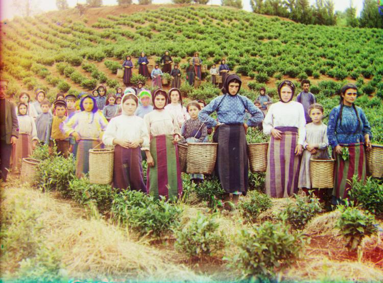
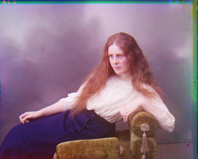
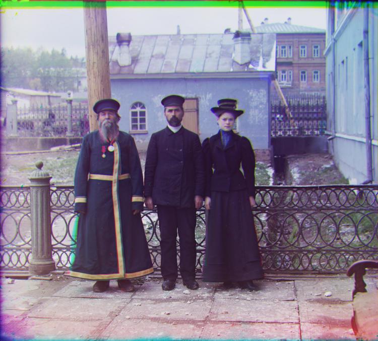
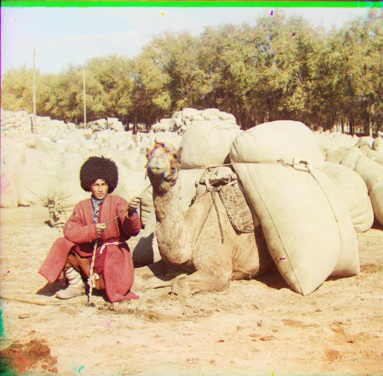
Extra Images
Here are some extra images run the through the whole pipeline just for fun.